Fashion
The same colour reads differently depending on the fabric it’s in, what it’s paired with, and what jewellery or eyewear sits near the face — this hub connects real garment and material photography to complete outfit palettes and named Colourwise profiles. Fashion colour guidance is subjective and highly personal, so everything here reflects common styling convention, not a universal rule.

Start with your task
Find it the way you would ask it
Six ways in, depending on what you already know. Most people arrive holding either a garment or a date in a diary.
What I am wearing
Start from the garment that occupies most of the outfit. Everything else is reacting to it.
Who I am coordinating with
Coordinating is not matching, and the number of people changes which strategies survive.
The occasion
What an occasion constrains — the light, the formality, whether it ends up in photographs — decides more than any rule about which colours suit it.
Eyes, hair and metal
One real optical effect, no seasons, no categories, and no colour anyone cannot wear.
My wardrobe
Outfit count is a product rather than a sum, which is the whole mechanism behind a capsule.
Something looks wrong
A diagnosis and the cheapest reversible fix, rather than a suggestion to start again.
Two harder questions, with tools
Both of these are asked constantly and answered badly almost everywhere — usually with a list of colours and no reasoning. Each has a calculator behind it that shows its working.
What do I wear if they’re wearing red?Six named ways to coordinate two outfits without matching, each with the reasoning behind it, the way it goes wrong, and substitutes when the colour is unavailable.How many outfits does my wardrobe actually make?The exact combination count, how many of them hold up on colour, which colour to add next, and which item is not earning its place.
What to wear with...
Every colour profile links to its own “what to wear with” page — see all colours.
Complete outfit palettes
A full role-based outfit — main garment, second garment, neutral, accent, footwear, jewellery and eyewear — rather than just one pairing at a time.
Calm neutral everyday
Easy, versatile, low-effort to put together.
Neutral-on-neutral combinations are easy to get right, but worth checking in daylight since subtle undertone mismatches show up most in flat, even light.
Navy and cream classic
Polished, dependable, quietly confident.
Navy can read as black under warm evening light — check the combination under daylight if the distinction matters.
Jewel-tone evening
Confident, luxurious, deliberately bold.
Saturated jewel tones can intensify further under warm evening lighting — a flattering effect for this kind of look, worth knowing about rather than being surprised by.
Jewel tones in satin or silk read noticeably brighter and more saturated than the same colour in matte cotton — expect real variation by fabric.
Silver-jewellery-led cool palette
Crisp, clean, built around silver as the starting point.
Silver's reflectivity means it visibly picks up nearby colours — check the full combination together, not the jewellery in isolation.
Jewellery, eyewear and fabric
What sits closest to the face — metal tone and frame colour — carries real visual weight, and the fabric a colour is woven into changes how it reads before styling is even considered.
Personal appearance
Hair colour, undertone, contrast level and eye colour all interact with clothing choices — explained carefully, never diagnosed.
Fashion questions
Pastel outfit combinations
Pale, low-saturation pastels in different hue families generally combine easily, since they share a similar soft, muted intensity.
Jewel-tone outfit combinations
Deep, highly saturated jewel tones — emerald, sapphire, ruby, amethyst-type colours — tend to look intentional and rich when combined, rather than needing to match a single hue family.
Muted outfit combinations
Muted, lower-saturation colours across different hue families generally sit well together for a calm, understated look.
Formal outfit colour combinations
Dark neutrals and deep jewel tones are the most commonly worn colours for formal occasions, often used as a base with a single deeper accent.
Wedding guest colour ideas
Soft pastels and richer jewel tones are both commonly worn by wedding guests — pale near-white neutrals are the main colours guests are generally advised to avoid.
Practical stories
Why a specific colour behaves the way it does — real photography connected to the mechanism behind what you’re seeing.
Why navy behaves like a neutral
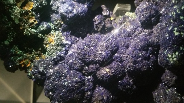
Navy sits so close to black in lightness that it pairs comfortably with almost any other colour the way a true neutral does, while still carrying a genuine (if subtle) blue identity that pure black lacks — the combination is why stylists commonly treat navy as a 'soft neutral' rather than a bold colour choice.
In practice: Treat navy as a safe base or anchor colour the way you would grey or black, rather than reserving it for occasions that call for a 'statement' colour.
Why velvet looks deeper than cotton
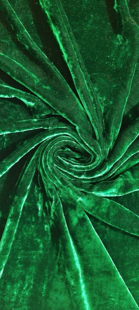
Velvet's raised pile traps light between individual fibres rather than reflecting it back cleanly the way a flat weave does, which is why the identical dye colour reads as noticeably darker and richer in velvet than in cotton — a genuine optical effect of the fabric's texture, not a different dye.
In practice: Expect a velvet garment to look deeper than its own colour name suggests when compared with a cotton or linen piece in 'the same' colour — this is normal, not a colour-matching failure.
Why jewellery changes a near-face palette
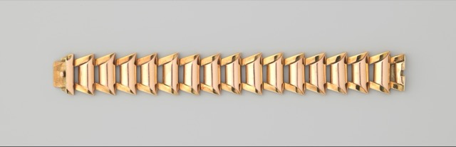
Jewellery sits close to the face and, being metallic, reflects light more directionally than fabric does — its warm or cool cast doesn't just decorate an outfit, it visibly interacts with nearby skin, hair and clothing tones the same way any strongly reflective surface changes the colour cast of what's next to it.
In practice: When judging whether an outfit's colours work together, include jewellery in the comparison rather than treating it as a neutral afterthought — a warm gold piece can shift the overall warmth of a cool-toned outfit.
Why two neutrals can clash

Almost no 'neutral' colour is perfectly neutral — most carry a faint warm or cool undertone that's invisible in isolation but becomes visible the moment two different neutrals are placed together, which is why a warm-toned beige and a cool-toned grey can look mismatched even though both are technically 'neutrals'.
In practice: When combining two neutral pieces, check their undertones against each other directly rather than assuming any two neutrals will automatically coordinate.
More
Neutral, bold and subtle pairings
See balanced, bold, subtle and accessible pairing options for any colour.
Nature-inspired palettes
Earth tones, botanical greens and jewel tones drawn from real environments — colour inspiration only, never a recommendation involving animal skins or endangered wildlife products.
Fashion colour choices are highly personal — lighting, fabric, personal preference and individual appearance all matter. The guidance here reflects common styling convention and real photography, not a guarantee of how a colour will look on any specific person — try options and compare rather than follow a fixed rule. See methodology.