Black
The darkest neutral, absorbing rather than reflecting visible light.
At a glance
- Hue family
- neutral
- Warmth
- neutral
- Tone depth
- very deep
- Saturation
- Moderate
Quick intelligence summary
- Feels like
- neutral, very deep, balanced
- Works well with
- See the pairings section below for calculated harmony options.
- Common uses
- See uses & contexts below for interiors, fashion and practical guidance.
- Accessibility snapshot
- Pairs better with white text (21.0:1) than black (1.0:1).
See this colour in the real world
Colours in photographs vary with lighting, material, camera processing and screen calibration — the named colours below are visual approximations, not exact measurements.

Denim dye typically sits on the surface of the yarn rather than through it, which is why denim characteristically fades and lightens with wear — this piece is a deep, minimally faded wash.
This is an unusually dark, near-black denim wash rather than the classic mid-blue most people picture as 'denim' — treat this as one specific example, not a definition of the material."Jeans Texture" by Gaurav Dhwaj Khadka, CC BY-SA 4.0, via Wikimedia CommonsLicence details
- Source:
- Wikimedia Commons
- Creator:
- Gaurav Dhwaj Khadka
- Licence:
- CC BY-SA 4.0 — free to share and adapt commercially, provided the work is attributed and any adaptation is shared under the same licence.
- Reviewed:
- 2026-07-25

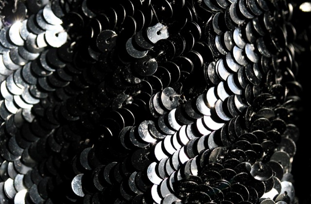
Each sequin acts as a tiny individual mirror — the fabric's overall colour and brightness depend on how many discs happen to be angled toward the light at once, which changes constantly with movement.
Sequins reflect light in discrete flashes depending on the exact angle of each disc, so the same fabric's overall brightness genuinely changes as it moves — a still photo captures only one instant of this."Sequins macro" by liz west, CC BY 2.0, via Wikimedia CommonsLicence details
- Source:
- Wikimedia Commons
- Creator:
- liz west
- Licence:
- CC BY 2.0 — free to share and adapt commercially, provided the work is attributed.
- Reviewed:
- 2026-07-25
Colour stories
Why dark colours can still work in a small room
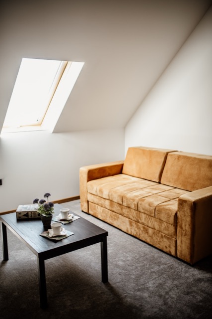
The common advice to use pale colours in small rooms assumes limited light to begin with — but a small room with a strong, direct light source (like this attic's skylight) can carry dark furniture and flooring without feeling cramped, because there's enough actual light for the eye to still read depth and detail in the dark tones.
In practice: The deciding factor for a small room isn't size alone — it's how much genuine light the room gets; a small, well-lit room can support a darker scheme that the same size room with little natural light usually can't.
Why black can dominate an outfit
Black has the lowest possible lightness value, which means it draws the eye and visually 'holds' more attention per unit of area than any other colour in an outfit — a small black accessory can end up reading as the outfit's focal point even when it's physically the smallest piece.
In practice: If the goal is for another colour to be the outfit's focal point, consider whether a black accessory nearby is quietly competing with it — sometimes a dark neutral like charcoal or navy achieves the same grounding effect with less visual pull.
Used in room palettes
Black appears in the following curated Interiors room palettes.
Black-fixture monochrome bathroom
Contemporary, graphic, confident in a small footprint.
High value contrast between pale walls and black fixtures is the entire point of this scheme.
Matte and gloss black fixtures reflect light very differently from each other — check the specific finish under the bathroom's actual lighting before committing.
Used in outfit palettes
Black appears in the following curated Fashion outfit palettes.
Monochrome black and white
Sharp, graphic, high-contrast.
High-contrast monochrome reads consistently across most lighting, one reason it's a dependable evening choice.
A matte black and a glossy black in the same outfit can read as two different colours side by side — check fabric finish, not just the colour name, when combining black pieces.
Jewel-tone evening
Confident, luxurious, deliberately bold.
Saturated jewel tones can intensify further under warm evening lighting — a flattering effect for this kind of look, worth knowing about rather than being surprised by.
Jewel tones in satin or silk read noticeably brighter and more saturated than the same colour in matte cotton — expect real variation by fabric.
Bold red and black statement
Confident, dramatic, unmistakably deliberate.
Saturated red can shift toward orange under warm indoor lighting — check the exact shade under the lighting it'll actually be worn in.
Red in a glossy fabric reads noticeably brighter than the same red in matte cotton — a real property of the fabric's finish, not a colour-matching error.
Used in historical palettes
Black appears in the following curated historical/cultural palettes.
Roman fresco colours
Wall painting in Roman villas and public buildings
1st century BCE to 1st century CE · Roman Italy
These HEX values are a modern digital approximation for comparison — they cannot exactly reproduce a historical physical pigment, dye or dyed cloth, whose appearance also varied by batch, ageing and the light it was viewed in.
Medieval illuminated manuscript palette
Illuminated religious manuscripts
12th to 15th century · Europe
These HEX values are a modern digital approximation for comparison — they cannot exactly reproduce a historical physical pigment, dye or dyed cloth, whose appearance also varied by batch, ageing and the light it was viewed in.
Art Deco palette
1920s-1930s architecture, fashion and design
1920s to 1930s · Europe and North America
These HEX values are a modern digital approximation for comparison — they cannot exactly reproduce a historical physical pigment, dye or dyed cloth, whose appearance also varied by batch, ageing and the light it was viewed in.
Heraldic colour palette
European heraldry (coats of arms)
12th century onward · Europe
These HEX values are a modern digital approximation for comparison — they cannot exactly reproduce a historical physical pigment, dye or dyed cloth, whose appearance also varied by batch, ageing and the light it was viewed in.
Victorian half-mourning palette
British mourning dress etiquette
19th century (Victorian era) · Britain
These HEX values are a modern digital approximation for comparison — they cannot exactly reproduce a historical physical pigment, dye or dyed cloth, whose appearance also varied by batch, ageing and the light it was viewed in.
Pairings
Subtle, bold, analogous, complementary and neutral options — established design convention, not a guarantee of visual success in every context.
Complementary
Opposite hues (180° apart) for maximum hue contrast.
Analogous
Neighbouring hues on the colour wheel for a low-contrast, harmonious feel.
Analogous
Neighbouring hues on the colour wheel for a low-contrast, harmonious feel.
Triadic
Three hues evenly spaced around the colour wheel for balanced contrast.
Triadic
Three hues evenly spaced around the colour wheel for balanced contrast.
Split-complementary
The two hues bracketing the complement, for contrast with less tension.
Split-complementary
The two hues bracketing the complement, for contrast with less tension.
Tetradic
Four hues at 90° steps around the colour wheel for a rich, varied palette.
Tetradic
Four hues at 90° steps around the colour wheel for a rich, varied palette.
Tetradic
Four hues at 90° steps around the colour wheel for a rich, varied palette.
Monochromatic
Same hue at different lightness levels, for a cohesive tonal palette.
Monochromatic
Same hue at different lightness levels, for a cohesive tonal palette.
Monochromatic
Same hue at different lightness levels, for a cohesive tonal palette.
Monochromatic
Same hue at different lightness levels, for a cohesive tonal palette.
For an accessible, low-contrast-risk pairing, monochromatic (same-hue) combinations are usually the safest starting point — see the harmonies above.
Uses & contexts
Often confused with
Black vs Midnight BlueBlack is a true neutral with no hue; midnight blue carries a deep blue undertone and is often described in fashion as a softer alternative to black.Black vs Navy BlueNavy blue carries a clear deep-blue undertone and reads distinctly under strong light; black is a true neutral with no hue. Navy is commonly worn as a softer, less severe alternative to black.Black vs CharcoalCharcoal is a dark grey that retains a slight blue cast and visible lightness; black is the absence of reflected colour and has neither.
Using black in a real space
Worked out from this colour’s own measurements — its lightness, saturation and undertone — rather than written for it. That is why the guidance differs from one colour to the next even when the two look similar.
What role it can play
This is a large-surface colour. At chroma 0 it is restrained enough to cover a lot of ground without tiring, and too quiet to work as an accent.
Walls and large surfaces
strongChroma 0 sits inside the range walls and large surfaces carry without taking over the room. At L*0 it also absorbs a good deal of the light in the room, so plan the lighting alongside it rather than afterwards.
Secondary surfaces
strongChroma 0 sits inside the range secondary surfaces carry without taking over the room.
Furniture
strongChroma 0 sits inside the range furniture carry without taking over the room.
Rugs, curtains and bedding
strongChroma 0 sits inside the range rugs, curtains and bedding carry without taking over the room.
Trim and joinery
strongChroma 0 is restrained enough for trim and joinery without competing, which is what makes it easy to build around. Trim is a small area but a long edge, so it reads more than its square metreage suggests.
Accents and small objects
difficultAt chroma 0 this is too quiet to read as an accent — it will look like something that happened rather than something chosen.
As an accent: high-contrast accent
With almost no chroma, this works as an accent only through lightness. Against a mid-toned room it contrasts by being much lighter or much darker, not by being colourful.
How to distribute colour across a roomHow it behaves under different lightsensitive
- Under warm bulbs
- With almost no hue of its own, this mostly reports the colour of the light. Under warm bulbs it will read warm — which is not the colour changing but the colour being honest.
- Under cool bulbs
- Near-neutral under any source, so a cool bulb will simply make it read cool.
- In daylight
- Deep colours hold their identity in daylight better than pale ones, because there is more of the range left to work in. This will look most like itself in good indirect light.
- In a dim room
- At low light levels the eye's colour discrimination genuinely falls and deep colours converge toward each other. This will read as "dark" rather than as its own colour in a dim room unless it is lit.
- Compared with the sample card
- Already deep, so there is little further to fall — but on a large matte surface it will absorb enough light to look flatter than the sample.
What colour temperature actually means · Why two bulbs at the same rating can differ
With wood
Oak
works wellWith almost no hue of its own, this cannot argue with Oak, and there is 66 points of lightness between them so the two stay distinguishable.
Walnut
works wellWith almost no hue of its own, this cannot argue with Walnut, and there is 28 points of lightness between them so the two stay distinguishable.
Pine
works wellWith almost no hue of its own, this cannot argue with Pine, and there is 82 points of lightness between them so the two stay distinguishable.
Plywood
works wellWith almost no hue of its own, this cannot argue with Plywood, and there is 75 points of lightness between them so the two stay distinguishable.
Light wood (ash, birch, beech)
works wellWith almost no hue of its own, this cannot argue with Light wood (ash, birch, beech), and there is 86 points of lightness between them so the two stay distinguishable.
Dark wood
works wellWith almost no hue of its own, this cannot argue with Dark wood, and there is 22 points of lightness between them so the two stay distinguishable.
Reddish wood (mahogany, cherry, teak)
works wellWith almost no hue of its own, this cannot argue with Reddish wood (mahogany, cherry, teak), and there is 28 points of lightness between them so the two stay distinguishable.
With metal fittings
Brass
works wellWith almost no hue of its own, this cannot argue with Brass, and there is 68 points of lightness between them so the two stay distinguishable.
Gold-tone
works wellWith almost no hue of its own, this cannot argue with Gold-tone, and there is 68 points of lightness between them so the two stay distinguishable.
Chrome
works wellWith almost no hue of its own, this cannot argue with Chrome, and there is 81 points of lightness between them so the two stay distinguishable.
Stainless steel
works wellWith almost no hue of its own, this cannot argue with Stainless steel, and there is 76 points of lightness between them so the two stay distinguishable.
Black metal
needs careThis sits close to Black metal without matching it — near enough that the eye reads an attempted match and far enough that it fails. Either move decisively away or repeat the tone exactly.
Copper
works wellWith almost no hue of its own, this cannot argue with Copper, and there is 68 points of lightness between them so the two stay distinguishable.
Where it can go wrong
- May flatten against similar neutrals. With so little chroma the only thing separating this from a neighbouring beige or grey is lightness, so anything within about fifteen points of it will merge.
- May read as simply dark rather than as its own colour. Below about L*22 the eye stops distinguishing hue reliably in ordinary room light, so this needs good lighting to be seen as anything but black.
Continue exploring
Related questionThe history of blackBlack has meant mourning, formality, rebellion and luxury at different times and in different cultures — its meaning has always depended heavily on context rather than being fixed.Colour familyTry this nextbrown and blackOnce considered a styling mismatch, brown and black together is now widely accepted in modern fashion — the warm reddish-brown gives the neutral black some depth rather than clashing with it.Pairing guideRelated questionNight skyDeep, low-saturation blues and near-blacks reflect the very low light levels of a clear night, with a single bright accent for starlight.Nature paletteGo deeperRoman fresco coloursWall painting in Roman villas and public buildingsHistorical palette
Meaning & story
Mood
- Often associated with elegance, authority and formality.
Culture
- Traditionally worn for mourning in many Western cultures.
True of the neutral family generally
Inherited from the neutral hue family, not specifically documented about this exact shade — see methodology.
- Neutral colours are commonly used as versatile base tones in interiors, providing a flexible backdrop for furnishings and accent colours.
- Low-contrast neutral-on-neutral colour schemes can fail WCAG contrast requirements — always check contrast ratios for text and UI elements even within a neutral palette.
Culture & history topics
Pigment & family history
Used in weddings, mourning, religion, politics or festivals
Each of these is a separately scoped, separately sourced tradition — shown here because this colour appears in it, not because they share one meaning.
Moods
Terminology
Lighter, darker & directional variants
Calculated directional adjustments. Some directions converge on the same result from this starting colour — shown as one merged card with an explanation, not repeated duplicates. Generated shades link to a curated profile only when one is close enough.
Lighter
Lightness increased
Darker & Warmer & Cooler & Greener & Bluer & Redder & Yellower & More muted & More saturated
Lightness decreased From this starting colour, moving darker and warmer and cooler and greener and bluer and redder and yellower and more muted and more saturated converges on the same calculated result. This is close to the source colour itself — there is limited room left to move darker from here.
In nature
Technical details
Technical values
CMYK is an approximate device conversion, not a calibrated print value — see methodology.
Convert this colour to another format →
CSS/web-standard named colour value.
Characteristics
- Hue family
- neutral
- Undertone
- neutral
- Tone depth
- very deep
- Pastel
- No
- Earth tone
- No
- Jewel tone
- No
- Vivid
- No
- Greyness
- 100%
- Visual weight
- 60/100
Accessibility
vs. white text
21.00:1 — AAA
vs. black text
1.00:1 — fails
Confidence: medium · Qualification: identity_only, technically_qualified, curated_profile_eligible, search_index_eligible, comparison_eligible
Spotted something wrong? Suggest a correction.