Interiors
The same paint colour genuinely looks different depending on the room’s light, the finish you choose and whatever fixed materials it sits beside — a wall that looks crisp in a south-facing living room can look flat and grey in a north-facing hallway. This hub connects real rooms and materials to practical colour decisions, complete palettes and named Colourwise profiles.

Where to start
Room colour questions arrive from four directions, and they want different answers. What you already own is a constraint; what you are choosing is a decision; a problem is a diagnosis; and an effect is a brief. Starting from the right one saves a good deal of reading.
I already have…
The most constrained position and the easiest to advise on. What you cannot change decides most of what follows, which is why the coordinator asks for it first.
I am choosing…
Each of these is a different decision, because each occupies a different share of the room. A wall and a cushion are not the same problem even when the colour is.
My problem is…
Most room complaints have a specific and diagnosable cause, and it is usually not the one people reach for. A room that feels flat is rarely short of colour.
Start with your task
Explore by room
Lighting characteristics, common constraints and example palettes for the rooms you actually decorate.

Living Room
Living rooms often get variable light through the day — check a sample swatch at morning, midday and evening before committing to a large wall.

Bedroom
Warm artificial light in the evening (most bedside/overhead bulbs) can shift a cool colour warmer than it appears in daylight — view a sample under your actual evening lighting.

Kitchen
Kitchens often mix strong artificial task lighting with natural light — colours can read quite differently under each.

Bathroom
Bathrooms are frequently lit only by artificial light — a colour that looks right in a showroom may shift under your specific bulb colour temperature.

Hallway
Hallways frequently rely on artificial light alone — pale, reflective colours are commonly chosen to counter a lack of natural daylight.

Open-Plan Living
Different zones of an open-plan room commonly face different directions and get different light, sometimes noticeably so — the same colour can look quite different at each end of the room.
Explore by material
Undertone, real-world variation and cautions for the fixed materials you have to work around, not just calculated pairings.

Oak
Real oak ranges from pale, slightly yellow (fresh, lightly finished oak) through honey and amber (most common flooring) to a deeper orange-brown (aged or oiled oak).

Walnut
Walnut generally sits in a warm-to-neutral dark brown range, from a chocolate-brown heartwood to a slightly purplish-brown in some cuts.

Red Brick
Red brick spans a genuinely wide range — from orange-red through brick-red to a deeper brown-red — depending on the clay and firing.

Marble
Marble's base colour ranges from cool white-grey (e.g. Carrara-type) to warm cream (e.g. Botticino-type), with veining that can run grey, gold, brown or occasionally green.

Concrete
Concrete generally reads as a cool-to-neutral grey, though the exact tone depends heavily on the mix, aggregate and any pigment or sealant used.

Brass Fittings
Brass is a warm gold-yellow metal, ranging from a bright, polished gold tone to a duller, more muted antique-brass finish.
Understand light and finish
The same colour behaves differently depending on orientation, artificial-light colour temperature and the finish it’s painted in — this is real, well-understood colour science, not a caveat to skip past.
North vs south-facing roomsWarm vs cool artificial lightSample-to-wall differencesMatte vs gloss finishWarm whites vs cool whites
Featured room palettes
Complete palettes, not isolated swatches — each colour has a named role (wall, trim, ceiling, flooring, accent, hardware) drawn from the real Colourwise catalogue.
Calm neutral bedroom
Restful, understated, easy to live with long-term.
Deliberately low-contrast throughout — the palette's calm comes from restraint, not from a strong focal contrast.
Greige can lean noticeably cooler in a north-facing bedroom — see the north-facing rooms lighting guide before committing to a large wall.
Warm sage kitchen
Fresh but grounded, a common contemporary kitchen direction.
- Primary wallSage Green
- TrimOff-White
- Flooring / fixed materialClay
- Metal / hardwareBrass
- AccentTerracotta
Moderate contrast between the green wall and warm wood keeps the room from reading flat.
Kitchens often mix strong task lighting with daylight — check this combination under both before committing.
Real oak varies from pale and yellow to deep amber depending on species, cut and finish — treat clay here as a reference direction, not an exact match.
Navy and brass living room
Dramatic, confident, a common bold-scheme choice.
Deliberately high value contrast (dark wall, pale trim/ceiling) — this is the room's main organising decision.
Deep saturated colours read very differently under warm versus cool artificial light — see the warm-vs-cool artificial light guide before choosing bulbs for this room.
North-facing warm rescue
Counteracts a cool, flat room with warmth rather than fighting it.
Warm-on-warm with limited contrast, chosen to avoid amplifying the room's naturally flat light.
This palette assumes typical Northern Hemisphere north-facing light (cooler, indirect daylight); in the Southern Hemisphere the equivalent orientation is south-facing — see the lighting guide's hemisphere note.
Black-fixture monochrome bathroom
Contemporary, graphic, confident in a small footprint.
High value contrast between pale walls and black fixtures is the entire point of this scheme.
Matte and gloss black fixtures reflect light very differently from each other — check the specific finish under the bathroom's actual lighting before committing.
Soft greige open-plan scheme
Cohesive and calm across a large, multi-use space.
Low contrast between primary and secondary wall by design, so the space reads as one room rather than several competing ones.
An open-plan room commonly has different orientations and light levels in different zones — the same wall colour can look noticeably different at each end of the room; test a sample in every zone.
Practical stories
Why a specific colour behaves the way it does — real photography connected to the mechanism behind what you’re seeing.
Why cream can look yellow
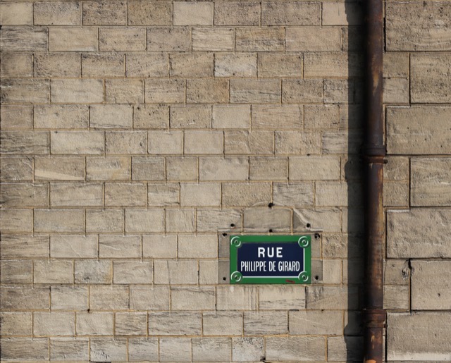
Cream is a very pale, warm-undertone colour sitting close to white on a colour chart. Because the human eye judges colour relative to its surroundings, cream reads as convincingly neutral next to a warmer wall or under daylight — but placed beside a true white, or seen under a warm incandescent bulb that already shifts everything yellow, the same cream can suddenly look distinctly yellow by comparison.
In practice: If a 'cream' wall looks more yellow than expected, compare it against the room's trim and check it under the room's actual bulbs before assuming the paint itself is wrong — simultaneous contrast and bulb colour temperature are both common, ordinary explanations.
Why grey can look green
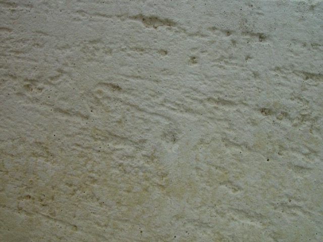
A 'neutral' grey paint rarely has zero underlying hue — most greys carry a faint green, blue or violet undertone that is invisible in isolation but becomes visible once the colour is seen at scale, next to certain artificial lighting, or beside a strongly coloured carpet or furniture that pushes the eye to perceive the opposite/complementary cast more strongly.
In practice: A grey that reads green once painted is very often revealing an undertone that was always there, not changing colour — checking the paint's own listed undertone before buying, and testing a large sample next to the room's actual flooring, catches this before a whole wall is painted.
Why navy can look black

Navy blue is a very low-lightness, high-saturation colour — physically closer to black on a lightness scale than most people expect. In anything less than good, even light, navy loses the subtle blue cues (a slightly lighter edge, a cooler cast under daylight) that distinguish it from true black, and the eye reads it as black instead.
In practice: To confirm a colour is genuinely navy rather than black, view it in strong daylight or beside a true black sample — under dim or warm evening lighting, don't be surprised if a correctly-navy wall reads as black; that's expected, not a fault.
Why oak changes the apparent undertone of a wall colour
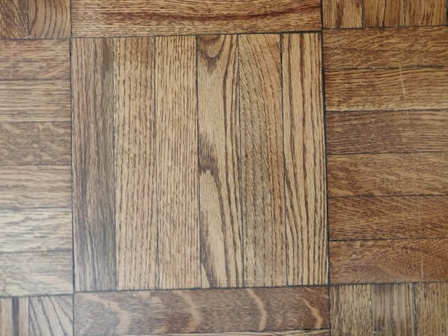
Oak flooring has a strong, warm yellow-orange undertone of its own. Simultaneous contrast means a nearby wall colour is perceived partly relative to that flooring — a wall that reads as a clean neutral grey in a shop, away from any oak, can pick up a faint cool or pink cast once placed above a warm oak floor, because the eye is compensating for the floor's own warmth.
In practice: Always check a shortlisted wall colour directly above the actual oak flooring sample, not against a neutral backdrop — the pairing, not the paint chip alone, is what will actually be lived with.
Why a gloss finish changes how a colour looks
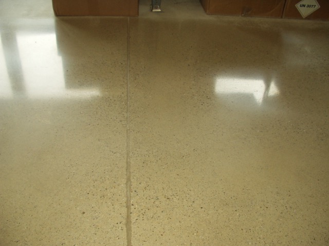
A glossy or polished surface reflects light specularly (in a concentrated, mirror-like way) rather than scattering it evenly the way a matte surface does. This means a glossy surface's apparent colour and brightness change sharply depending on the exact viewing angle and what's nearby to reflect — the same underlying colour can look far lighter, darker or more saturated depending on where the highlight falls.
In practice: Judge a gloss or high-sheen finish sample from more than one angle and under more than one light position before deciding — a flat photo of a glossy swatch is one of the least reliable ways to judge how the finish will actually look.
Why north-facing rooms feel cooler
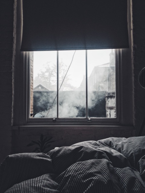
A north-facing window (in the Northern Hemisphere) never receives direct sun — only indirect skylight, which is itself more blue-shifted than direct sunlight. This soft, diffuse, slightly cool light is genuinely different in colour temperature from the warm, direct light a south-facing window gets, which is why the same paint reads cooler and flatter in a north-facing room.
In practice: A colour that looks warm and inviting on a south-facing shop wall may read noticeably cooler in a north-facing room — always test a sample in the room's own light, and see the north-facing rooms lighting guide for how to compensate.
Tools
Room Colour Coordinator
Tell it what you already have and it works out what could go with it, and why.
Find My Colour
Start from a name or code you already have.
Build a Room Palette
Get a complete palette for your room and fixed materials.
Compare Colours
Check two shortlisted colours side by side.
Adjust My Colour
Nudge a colour warmer, cooler, lighter or darker.
What Goes With
Find calculated pairings for a wall, trim or accent colour.
Contrast Checker
Check trim-to-wall or text-to-background contrast.
Colour choices for interiors are highly context-dependent — light, room size, existing materials and personal taste all matter. Screen colours may not exactly match physical paint. The guidance here reflects common design convention and real photography, not a guarantee of how a colour will look in your specific space — always check a physical sample under your own lighting. See methodology.