Gold
A rich, warm yellow evoking the metal.
At a glance
- Hue family
- yellow
- Warmth
- neutral
- Tone depth
- medium
- Saturation
- Vivid
Quick intelligence summary
- Feels like
- neutral, medium, vivid
- Works well with
- See the pairings section below for calculated harmony options.
- Common uses
- See uses & contexts below for interiors, fashion and practical guidance.
- Accessibility snapshot
- Pairs better with black text (15.0:1) than white (1.4:1).
See this colour in the real world
Colours in photographs vary with lighting, material, camera processing and screen calibration — the named colours below are visual approximations, not exact measurements.

This early-to-mid-20th-century Dutch gold bracelet still carries its original hallmark stamps — a reminder that polished gold jewellery can retain its warm colour and shine across generations with basic care.
This photo is set against a plain grey museum background that dominates a raw automated colour scan — this palette was reviewed to represent the gold itself, not the backdrop."Armband van goud" (gold bracelet), Rijksmuseum, object BK-2018-2-27, CC0Licence details
- Source:
- Wikimedia Commons (Rijksmuseum)
- Licence:
- CC0 1.0 Universal Public Domain Dedication — the Rijksmuseum has waived all rights on this digitised object photograph; free for any use including commercial, without attribution required.
- Reviewed:
- 2026-07-25
Colour stories
Why jewellery changes a near-face palette
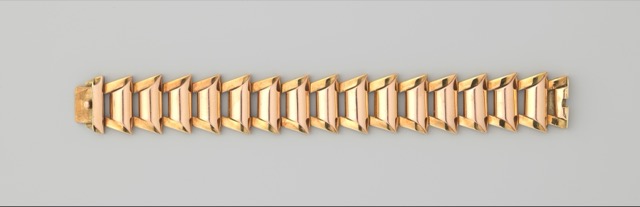
Jewellery sits close to the face and, being metallic, reflects light more directionally than fabric does — its warm or cool cast doesn't just decorate an outfit, it visibly interacts with nearby skin, hair and clothing tones the same way any strongly reflective surface changes the colour cast of what's next to it.
In practice: When judging whether an outfit's colours work together, include jewellery in the comparison rather than treating it as a neutral afterthought — a warm gold piece can shift the overall warmth of a cool-toned outfit.
Used in outfit palettes
Gold appears in the following curated Fashion outfit palettes.
Navy and cream classic
Polished, dependable, quietly confident.
Navy can read as black under warm evening light — check the combination under daylight if the distinction matters.
Jewel-tone evening
Confident, luxurious, deliberately bold.
Saturated jewel tones can intensify further under warm evening lighting — a flattering effect for this kind of look, worth knowing about rather than being surprised by.
Jewel tones in satin or silk read noticeably brighter and more saturated than the same colour in matte cotton — expect real variation by fabric.
Green-eye-inspired accent palette
An optional way to echo green eyes without matching them literally.
This is an optional styling idea, not a claim that green clothing makes green eyes look a specific way — eye colour perception itself varies with lighting.
Brown-eye-inspired warm palette
An optional way to echo brown eyes without matching them literally.
This is an optional styling idea, not a claim that any clothing colour changes eye colour itself.
Gold-jewellery-led warm palette
Rich, warm, built around gold as the starting point.
Gold intensifies further under warm evening light — expect this palette to look even richer at night than in daylight photos.
Used in historical palettes
Gold appears in the following curated historical/cultural palettes.
Ancient Egyptian pigments
Tomb and temple wall painting
Third millennium BCE onward · Egypt
These HEX values are a modern digital approximation for comparison — they cannot exactly reproduce a historical physical pigment, dye or dyed cloth, whose appearance also varied by batch, ageing and the light it was viewed in.
Medieval illuminated manuscript palette
Illuminated religious manuscripts
12th to 15th century · Europe
These HEX values are a modern digital approximation for comparison — they cannot exactly reproduce a historical physical pigment, dye or dyed cloth, whose appearance also varied by batch, ageing and the light it was viewed in.
Art Deco palette
1920s-1930s architecture, fashion and design
1920s to 1930s · Europe and North America
These HEX values are a modern digital approximation for comparison — they cannot exactly reproduce a historical physical pigment, dye or dyed cloth, whose appearance also varied by batch, ageing and the light it was viewed in.
Heraldic colour palette
European heraldry (coats of arms)
12th century onward · Europe
These HEX values are a modern digital approximation for comparison — they cannot exactly reproduce a historical physical pigment, dye or dyed cloth, whose appearance also varied by batch, ageing and the light it was viewed in.
Chinese wedding palette
Traditional Chinese wedding dress and decoration
Traditional, still in wide use today · China and Chinese diaspora communities
These HEX values are a modern digital approximation for comparison — they cannot exactly reproduce a historical physical pigment, dye or dyed cloth, whose appearance also varied by batch, ageing and the light it was viewed in.
Pairings
Subtle, bold, analogous, complementary and neutral options — established design convention, not a guarantee of visual success in every context.
Complementary
Opposite hues (180° apart) for maximum hue contrast.
Analogous
Neighbouring hues on the colour wheel for a low-contrast, harmonious feel.
Analogous
Neighbouring hues on the colour wheel for a low-contrast, harmonious feel.
Triadic
Three hues evenly spaced around the colour wheel for balanced contrast.
Triadic
Three hues evenly spaced around the colour wheel for balanced contrast.
Split-complementary
The two hues bracketing the complement, for contrast with less tension.
Split-complementary
The two hues bracketing the complement, for contrast with less tension.
Tetradic
Four hues at 90° steps around the colour wheel for a rich, varied palette.
Tetradic
Four hues at 90° steps around the colour wheel for a rich, varied palette.
Tetradic
Four hues at 90° steps around the colour wheel for a rich, varied palette.
No curated profile yet
Monochromatic
Same hue at different lightness levels, for a cohesive tonal palette.
No curated profile yet
Monochromatic
Same hue at different lightness levels, for a cohesive tonal palette.
Monochromatic
Same hue at different lightness levels, for a cohesive tonal palette.
Monochromatic
Same hue at different lightness levels, for a cohesive tonal palette.
For an accessible, low-contrast-risk pairing, monochromatic (same-hue) combinations are usually the safest starting point — see the harmonies above.
Uses & contexts
Often confused with
Using gold in a real space
Worked out from this colour’s own measurements — its lightness, saturation and undertone — rather than written for it. That is why the guidance differs from one colour to the next even when the two look similar.
What role it can play
This is a small-scale colour. At chroma 87 it holds attention easily, which is a strength on a cushion or a door and a liability across four walls.
Walls and large surfaces
difficultAt chroma 87 this is far above the level walls and large surfaces usually carry comfortably. It can be done deliberately, but it will be the room rather than part of it.
Secondary surfaces
difficultAt chroma 87 this is far above the level secondary surfaces usually carry comfortably. It can be done deliberately, but it will be the room rather than part of it.
Furniture
difficultAt chroma 87 this is far above the level furniture usually carry comfortably. It can be done deliberately, but it will be the room rather than part of it.
Rugs, curtains and bedding
difficultAt chroma 87 this is far above the level rugs, curtains and bedding usually carry comfortably. It can be done deliberately, but it will be the room rather than part of it.
Trim and joinery
workableChroma 87 is above the usual comfort level for trim and joinery, so expect it to take charge. That is a legitimate choice in a room that wants a subject. Trim is a small area but a long edge, so it reads more than its square metreage suggests. Its lightness makes it a conventional trim choice, which is a strength when the walls should be the subject.
Accents and small objects
strongChroma 87 is exactly what an accent is for. The saturation that makes this difficult across a wall is the reason it works on a cushion, a door or a single chair.
As an accent: one controlled accent
At chroma 87 this is assertive enough that one appearance is a statement and three is a scheme. Use it once, deliberately, and let the rest of the room stay quiet.
How to distribute colour across a roomHow it behaves under different lightresilient
- Under warm bulbs
- With almost no hue of its own, this mostly reports the colour of the light. Under warm bulbs it will read warm — which is not the colour changing but the colour being honest.
- Under cool bulbs
- Near-neutral under any source, so a cool bulb will simply make it read cool.
- In daylight
- In strong daylight a colour this light approaches the top of its range, and differences between it and other pale colours compress. It can look washed out at midday in a south-facing room and return in the evening.
- In a dim room
- Enough lightness and chroma to stay recognisable in a dim room, though it will lose some saturation.
- Compared with the sample card
- Pale colours almost always read darker in place than on a card, because a card is seen against white and a wall is seen against itself. Expect a step down.
What colour temperature actually means · Why two bulbs at the same rating can differ
With wood
Oak
needs careShares Oak's neutral bias, but at chroma 87 against a material that already carries colour of its own, the two compete rather than combine. It works when this colour is confined to a small area and fails when both are large. The amount of timber matters as much as the tone: one piece is an accent, a floor plus joinery is the room's dominant colour.
Walnut
works wellShares Walnut's neutral bias, so the two agree about the temperature of the room. There is also 59 points of lightness between them, which keeps the two readable as separate elements. The amount of timber matters as much as the tone: one piece is an accent, a floor plus joinery is the room's dominant colour.
Pine
needs careThis sits close to Pine without matching it — near enough that the eye reads an attempted match and far enough that it fails. Either move decisively away or repeat the tone exactly.
Plywood
needs careShares Plywood's neutral bias, but at chroma 87 against a material that already carries colour of its own, the two compete rather than combine. It works when this colour is confined to a small area and fails when both are large. The amount of timber matters as much as the tone: one piece is an accent, a floor plus joinery is the room's dominant colour.
Light wood (ash, birch, beech)
works wellShares Light wood (ash, birch, beech)'s neutral bias, so the two agree about the temperature of the room. They sit close in depth, so expect a quiet, tonal relationship rather than a contrast. The amount of timber matters as much as the tone: one piece is an accent, a floor plus joinery is the room's dominant colour.
Dark wood
works wellShares Dark wood's neutral bias, so the two agree about the temperature of the room. There is also 65 points of lightness between them, which keeps the two readable as separate elements. The amount of timber matters as much as the tone: one piece is an accent, a floor plus joinery is the room's dominant colour.
Reddish wood (mahogany, cherry, teak)
works wellShares Reddish wood (mahogany, cherry, teak)'s neutral bias, so the two agree about the temperature of the room. There is also 59 points of lightness between them, which keeps the two readable as separate elements. The amount of timber matters as much as the tone: one piece is an accent, a floor plus joinery is the room's dominant colour.
With metal fittings
Brass
needs careThis sits close to Brass without matching it — near enough that the eye reads an attempted match and far enough that it fails. Either move decisively away or repeat the tone exactly.
Gold-tone
needs careThis sits close to Gold-tone without matching it — near enough that the eye reads an attempted match and far enough that it fails. Either move decisively away or repeat the tone exactly.
Chrome
works wellShares Chrome's neutral bias, so the two agree about the temperature of the room. They sit close in depth, so expect a quiet, tonal relationship rather than a contrast. Metal carries more attention than its area suggests, so repetition matters more than the exact finish.
Stainless steel
works wellShares Stainless steel's neutral bias, so the two agree about the temperature of the room. They sit close in depth, so expect a quiet, tonal relationship rather than a contrast. Metal carries more attention than its area suggests, so repetition matters more than the exact finish.
Black metal
works wellShares Black metal's neutral bias, so the two agree about the temperature of the room. There is also 80 points of lightness between them, which keeps the two readable as separate elements. Metal carries more attention than its area suggests, so repetition matters more than the exact finish.
Copper
needs careThis sits close to Copper without matching it — near enough that the eye reads an attempted match and far enough that it fails. Either move decisively away or repeat the tone exactly.
Where it can go wrong
- May overwhelm at any size above an accent. At chroma 87 this holds attention involuntarily, so a room containing much of it will be about this colour whether or not that was intended. It also makes every other colour in the room look more muted by comparison.
Continue exploring
Related questionTropicalSaturated jewel-tone greens, pinks and blues echo the high-contrast, high-saturation colour common among tropical flowers, birds and insects.Nature paletteGo deeperColour in medieval and Renaissance EuropeMedieval and Renaissance European painters worked within real material constraints — the most expensive pigments, especially natural ultramarine, were often reserved for the most important subjects in a painting, making pigment choice itself a signal of what mattered most.HistoryGo deeperColour, social class and royaltyHistorically, colours associated with royalty and high status were almost always the colours that were hardest and most expensive to produce reliably — the association was fundamentally economic before it became purely symbolic.HistoryGo deeperAncient Egyptian pigmentsTomb and temple wall paintingHistorical palette
Meaning & story
Branding
- Often used in branding to suggest luxury or premium quality.
True of the yellow family generally
Inherited from the yellow hue family, not specifically documented about this exact shade — see methodology.
- Yellow is often associated with cheerfulness and optimism.
- Yellow's inherently high lightness means yellow text or UI elements on a white background frequently fail WCAG contrast minimums — check contrast carefully before using yellow for text or fine detail.
Culture & history topics
Pigment & family history
Used in weddings, mourning, religion, politics or festivals
Each of these is a separately scoped, separately sourced tradition — shown here because this colour appears in it, not because they share one meaning.
Moods
Terminology
Lighter, darker & directional variants
Calculated directional adjustments. Some directions converge on the same result from this starting colour — shown as one merged card with an explanation, not repeated duplicates. Generated shades link to a curated profile only when one is close enough.
Lighter
Lightness increased
Darker
Lightness decreased
Warmer
Hue rotated toward warm (red/orange)
Cooler & Greener & Bluer
Hue rotated toward cool (blue) From this starting colour, moving cooler and greener and bluer converges on the same calculated result.
Redder
Hue rotated toward red
Yellower
Hue rotated toward yellow
More muted
Saturation softened
More saturated
Saturation increased This is close to the source colour itself — there is limited room left to move more saturated from here.
In nature
Technical details
Technical values
CMYK is an approximate device conversion, not a calibrated print value — see methodology.
Convert this colour to another format →
CSS/web-standard named colour value.
Characteristics
- Hue family
- yellow
- Undertone
- neutral
- Tone depth
- medium
- Pastel
- No
- Earth tone
- No
- Jewel tone
- Yes
- Vivid
- Yes
- Greyness
- 0%
- Visual weight
- 70/100
Accessibility
vs. white text
1.40:1 — fails
vs. black text
14.97:1 — AAA
Confidence: medium · Qualification: identity_only, technically_qualified, curated_profile_eligible, search_index_eligible, comparison_eligible
Spotted something wrong? Suggest a correction.