Purple
A medium-dark blend of red and blue.
At a glance
- Hue family
- purple
- Warmth
- neutral
- Tone depth
- deep
- Saturation
- Vivid
Similar to
Quick intelligence summary
- Feels like
- neutral, deep, vivid
- Works well with
- See the pairings section below for calculated harmony options.
- Common uses
- Interiors and fashion — see uses & contexts below.
- Accessibility snapshot
- Pairs better with white text (9.4:1) than black (2.2:1).
- Important cautions
- Confusable at a glance with violet and magenta: the web-standard purple value sits at an equal red-blue mix, while violet leans further toward blue and magenta leans further toward red.
See this colour in the real world
Colours in photographs vary with lighting, material, camera processing and screen calibration — the named colours below are visual approximations, not exact measurements.
.jpg)
Amethyst gets its purple colour from trace iron impurities in quartz crystal, altered by natural background radiation over geological time.
Faceted crystal photography scatters light unevenly across each facet, so a whole-frame automated scan is dominated by the pale background and shadow tones rather than the crystal's true colour — this palette was sampled from the most saturated regions of the crystal after reviewing the photo."Amethyst" by Darla Sondrol, Geoscience Digital Image Library (GeoDIL), CC0Licence details
- Source:
- Wikimedia Commons
- Creator:
- Darla Sondrol
- Licence:
- CC0 1.0 Universal Public Domain Dedication — the copyright holder has waived all rights; free to use for any purpose, including commercially, without asking permission.
- Reviewed:
- 2026-07-24

Lavender's purple comes from anthocyanin pigments in the flower — the same pigment family responsible for purple in many fruits and flowers.
The lavender rows fill most of the frame, so the deterministic colour-cluster scan is directly representative, including the sunlit path and foliage visible between rows."Lavender Field" by Kemal Atli, CC BY-SA 2.0, via Wikimedia CommonsLicence details
- Source:
- Wikimedia Commons
- Creator:
- Kemal Atli
- Licence:
- CC BY-SA 2.0 — free to share and adapt commercially, provided the work is attributed and any adaptation is shared under the same licence. Reviewed and confirmed by the Commons FlickreviewR bot from the original Flickr upload.
- Reviewed:
- 2026-07-24
Colour stories
Why rose quartz and amethyst are the same mineral, different colours
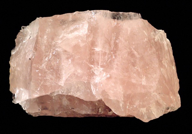
Rose quartz and amethyst are both varieties of quartz — silicon dioxide with the same crystal structure. Trace titanium, manganese or microscopic mineral fibres tint quartz pink; trace iron, altered by natural background radiation over geological time, tints it purple instead.
In practice: Colour in minerals often comes down to which trace element got trapped in the crystal as it grew, not a fundamentally different material — a useful reminder that a name like 'quartz' describes structure, not colour.
Used in historical palettes
Purple appears in the following curated historical/cultural palettes.
Suffragette protest palette
Women's Social and Political Union campaign material
Early 20th century · United Kingdom
These HEX values are a modern digital approximation for comparison — they cannot exactly reproduce a historical physical pigment, dye or dyed cloth, whose appearance also varied by batch, ageing and the light it was viewed in.
Victorian half-mourning palette
British mourning dress etiquette
19th century (Victorian era) · Britain
These HEX values are a modern digital approximation for comparison — they cannot exactly reproduce a historical physical pigment, dye or dyed cloth, whose appearance also varied by batch, ageing and the light it was viewed in.
Pairings
Subtle, bold, analogous, complementary and neutral options — established design convention, not a guarantee of visual success in every context.
Complementary
Opposite hues (180° apart) for maximum hue contrast.
Analogous
Neighbouring hues on the colour wheel for a low-contrast, harmonious feel.
Analogous
Neighbouring hues on the colour wheel for a low-contrast, harmonious feel.
Triadic
Three hues evenly spaced around the colour wheel for balanced contrast.
Triadic
Three hues evenly spaced around the colour wheel for balanced contrast.
Split-complementary
The two hues bracketing the complement, for contrast with less tension.
Split-complementary
The two hues bracketing the complement, for contrast with less tension.
Tetradic
Four hues at 90° steps around the colour wheel for a rich, varied palette.
Tetradic
Four hues at 90° steps around the colour wheel for a rich, varied palette.
Tetradic
Four hues at 90° steps around the colour wheel for a rich, varied palette.
Monochromatic
Same hue at different lightness levels, for a cohesive tonal palette.
Monochromatic
Same hue at different lightness levels, for a cohesive tonal palette.
Monochromatic
Same hue at different lightness levels, for a cohesive tonal palette.
Monochromatic
Same hue at different lightness levels, for a cohesive tonal palette.
For an accessible, low-contrast-risk pairing, monochromatic (same-hue) combinations are usually the safest starting point — see the harmonies above.
Uses & contexts
Using purple in a real space
Worked out from this colour’s own measurements — its lightness, saturation and undertone — rather than written for it. That is why the guidance differs from one colour to the next even when the two look similar.
What role it can play
This is a small-scale colour. At chroma 69 it holds attention easily, which is a strength on a cushion or a door and a liability across four walls.
Walls and large surfaces
difficultAt chroma 69 this is far above the level walls and large surfaces usually carry comfortably. It can be done deliberately, but it will be the room rather than part of it.
Secondary surfaces
workableChroma 69 is above the usual comfort level for secondary surfaces, so expect it to take charge. That is a legitimate choice in a room that wants a subject. On panelling, a chimney breast or an alcove this is semi-permanent — repaintable, but not casually.
Furniture
workableChroma 69 is above the usual comfort level for furniture, so expect it to take charge. That is a legitimate choice in a room that wants a subject. In a sofa or a cabinet this is one purchase you will live with, so it is worth seeing the piece in the actual room first.
Rugs, curtains and bedding
workableChroma 69 is above the usual comfort level for rugs, curtains and bedding, so expect it to take charge. That is a legitimate choice in a room that wants a subject. In rugs, curtains and bedding it is the cheapest commitment in the room to reverse, which makes it the right place to test a strong colour.
Trim and joinery
strongChroma 69 sits inside the range trim and joinery carry without taking over the room.
Accents and small objects
strongChroma 69 is exactly what an accent is for. The saturation that makes this difficult across a wall is the reason it works on a cushion, a door or a single chair.
As an accent: one controlled accent
At chroma 69 this is assertive enough that one appearance is a statement and three is a scheme. Use it once, deliberately, and let the rest of the room stay quiet.
How to distribute colour across a roomHow it behaves under different lightresilient
- Under warm bulbs
- With almost no hue of its own, this mostly reports the colour of the light. Under warm bulbs it will read warm — which is not the colour changing but the colour being honest.
- Under cool bulbs
- Near-neutral under any source, so a cool bulb will simply make it read cool.
- In daylight
- Deep colours hold their identity in daylight better than pale ones, because there is more of the range left to work in. This will look most like itself in good indirect light.
- In a dim room
- At low light levels the eye's colour discrimination genuinely falls and deep colours converge toward each other. This will read as "dark" rather than as its own colour in a dim room unless it is lit.
- Compared with the sample card
- Already deep, so there is little further to fall — but on a large matte surface it will absorb enough light to look flatter than the sample.
What colour temperature actually means · Why two bulbs at the same rating can differ
With wood
Oak
needs careShares Oak's neutral bias, but at chroma 69 against a material that already carries colour of its own, the two compete rather than combine. It works when this colour is confined to a small area and fails when both are large. The amount of timber matters as much as the tone: one piece is an accent, a floor plus joinery is the room's dominant colour.
Walnut
works wellShares Walnut's neutral bias, so the two agree about the temperature of the room. They sit close in depth, so expect a quiet, tonal relationship rather than a contrast. The amount of timber matters as much as the tone: one piece is an accent, a floor plus joinery is the room's dominant colour.
Pine
needs careShares Pine's neutral bias, but at chroma 69 against a material that already carries colour of its own, the two compete rather than combine. It works when this colour is confined to a small area and fails when both are large. The amount of timber matters as much as the tone: one piece is an accent, a floor plus joinery is the room's dominant colour.
Plywood
needs careShares Plywood's neutral bias, but at chroma 69 against a material that already carries colour of its own, the two compete rather than combine. It works when this colour is confined to a small area and fails when both are large. The amount of timber matters as much as the tone: one piece is an accent, a floor plus joinery is the room's dominant colour.
Light wood (ash, birch, beech)
works wellShares Light wood (ash, birch, beech)'s neutral bias, so the two agree about the temperature of the room. There is also 56 points of lightness between them, which keeps the two readable as separate elements. The amount of timber matters as much as the tone: one piece is an accent, a floor plus joinery is the room's dominant colour.
Dark wood
works wellShares Dark wood's neutral bias, so the two agree about the temperature of the room. They sit close in depth, so expect a quiet, tonal relationship rather than a contrast. The amount of timber matters as much as the tone: one piece is an accent, a floor plus joinery is the room's dominant colour.
Reddish wood (mahogany, cherry, teak)
works wellShares Reddish wood (mahogany, cherry, teak)'s neutral bias, so the two agree about the temperature of the room. They sit close in depth, so expect a quiet, tonal relationship rather than a contrast. The amount of timber matters as much as the tone: one piece is an accent, a floor plus joinery is the room's dominant colour.
With metal fittings
Brass
needs careShares Brass's neutral bias, but at chroma 69 against a material that already carries colour of its own, the two compete rather than combine. It works when this colour is confined to a small area and fails when both are large. Metal carries more attention than its area suggests, so repetition matters more than the exact finish.
Gold-tone
needs careShares Gold-tone's neutral bias, but at chroma 69 against a material that already carries colour of its own, the two compete rather than combine. It works when this colour is confined to a small area and fails when both are large. Metal carries more attention than its area suggests, so repetition matters more than the exact finish.
Chrome
works wellShares Chrome's neutral bias, so the two agree about the temperature of the room. There is also 51 points of lightness between them, which keeps the two readable as separate elements. Metal carries more attention than its area suggests, so repetition matters more than the exact finish.
Stainless steel
works wellShares Stainless steel's neutral bias, so the two agree about the temperature of the room. There is also 46 points of lightness between them, which keeps the two readable as separate elements. Metal carries more attention than its area suggests, so repetition matters more than the exact finish.
Black metal
works wellShares Black metal's neutral bias, so the two agree about the temperature of the room. There is also 23 points of lightness between them, which keeps the two readable as separate elements. Metal carries more attention than its area suggests, so repetition matters more than the exact finish.
Copper
needs careShares Copper's neutral bias, but at chroma 69 against a material that already carries colour of its own, the two compete rather than combine. It works when this colour is confined to a small area and fails when both are large. Metal carries more attention than its area suggests, so repetition matters more than the exact finish.
Where it can go wrong
- May dominate a small or dim room. At L*30 and chroma 69 it absorbs light and holds attention at the same time, which is a lot to ask of a space that has little of either.
Continue exploring
Related questionSunsetA warm gradient from yellow through orange to deep pink-purple mirrors how scattering shifts the visible colour of low-angle sunlight.Nature paletteGo deeperA brief history of colourThe history of colour is largely a history of what could be reliably produced and afforded: early pigments came from earth and minerals, expensive dyes marked status for millennia, and 19th-century synthetic chemistry rapidly made colour cheap, stable and universally available for the first time.HistoryGo deeperColour in medieval and Renaissance EuropeMedieval and Renaissance European painters worked within real material constraints — the most expensive pigments, especially natural ultramarine, were often reserved for the most important subjects in a painting, making pigment choice itself a signal of what mattered most.HistoryGo deeperColour, social class and royaltyHistorically, colours associated with royalty and high status were almost always the colours that were hardest and most expensive to produce reliably — the association was fundamentally economic before it became purely symbolic.History
Meaning & story
History
- Historically, purple dye (Tyrian purple) was extremely costly to produce, which associated the colour with royalty and status in many cultures.
Name origin
- Named after Tyrian purple, a dye extracted from the mucus glands of Murex sea snails by ancient Phoenician dyers in the city of Tyre.
Interiors
- Often used sparingly as an accent rather than a dominant wall colour — at full saturation, purple can read as visually heavy in a way lighter or more muted hues don't.
Accessibility
- Confusable at a glance with violet and magenta: the web-standard purple value sits at an equal red-blue mix, while violet leans further toward blue and magenta leans further toward red.
True of the purple family generally
Inherited from the purple hue family, not specifically documented about this exact shade — see methodology.
- Purple dye — notably Tyrian purple, extracted from sea snails — was historically extremely costly to produce, which associated the colour with royalty, wealth and status across several ancient and medieval cultures.
Culture & history topics
Pigment & family history
Used in weddings, mourning, religion, politics or festivals
Each of these is a separately scoped, separately sourced tradition — shown here because this colour appears in it, not because they share one meaning.
Terminology
Lighter, darker & directional variants
Calculated directional adjustments. Some directions converge on the same result from this starting colour — shown as one merged card with an explanation, not repeated duplicates. Generated shades link to a curated profile only when one is close enough.
Lighter
Lightness increased
Darker
Lightness decreased
Warmer & Redder & Yellower
Hue rotated toward warm (red/orange) From this starting colour, moving warmer and redder and yellower converges on the same calculated result.
Cooler & Greener & Bluer
Hue rotated toward cool (blue) From this starting colour, moving cooler and greener and bluer converges on the same calculated result.
More muted
Saturation softened
More saturated
Saturation increased This is close to the source colour itself — there is limited room left to move more saturated from here.
In nature
Technical details
Technical values
CMYK is an approximate device conversion, not a calibrated print value — see methodology.
Convert this colour to another format →
CSS/web-standard named colour value.
Characteristics
- Hue family
- purple
- Undertone
- neutral
- Tone depth
- deep
- Pastel
- No
- Earth tone
- No
- Jewel tone
- Yes
- Vivid
- Yes
- Greyness
- 0%
- Visual weight
- 85/100
Accessibility
vs. white text
9.42:1 — AAA
vs. black text
2.23:1 — fails
Confidence: medium · Qualification: identity_only, technically_qualified, curated_profile_eligible, search_index_eligible, comparison_eligible, premium_report_eligible
Spotted something wrong? Suggest a correction.