Graphite
A very dark, neutral grey named for the mineral.
At a glance
- Hue family
- neutral
- Warmth
- neutral
- Tone depth
- deep
- Saturation
- Moderate
Quick intelligence summary
- Feels like
- neutral, deep, balanced
- Works well with
- See the pairings section below for calculated harmony options.
- Common uses
- See uses & contexts below for interiors, fashion and practical guidance.
- Accessibility snapshot
- Pairs better with white text (11.7:1) than black (1.8:1).
See this colour in the real world
Colours in photographs vary with lighting, material, camera processing and screen calibration — the named colours below are visual approximations, not exact measurements.

Thin metal frames generally carry the least visual weight of any frame style, which is why the frame's own metal tone (cool pewter-grey here) tends to matter more for coordination than the frame shape itself.
This photo is composed over a page of printed text specifically to show the lens's gradient effect — the frame's own colour is a small part of the frame, reviewed separately from the text background."Progressive Trifocal Lens" by Stanistani, CC BY-SA 3.0, via Wikimedia CommonsLicence details
- Source:
- Wikimedia Commons
- Creator:
- Stanistani
- Licence:
- CC BY-SA 3.0 — free to share and adapt commercially, provided the work is attributed and any adaptation is shared under the same licence.
- Reviewed:
- 2026-07-25
Colour stories
Why monochrome still needs depth variation
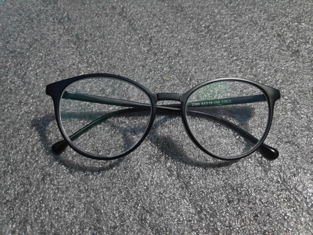
A truly flat, single-value monochrome outfit can visually blur into one shapeless mass, since the eye relies on lightness differences to read where one garment ends and another begins — a matte black frame photographed here shows how even 'one colour' still shows real tonal variation once light and material interact with it.
In practice: When building a monochrome outfit, vary fabric finish (matte versus glossy) or fine value differences between pieces so the outfit still reads as having visible structure, not one flat block of colour.
Pairings
Subtle, bold, analogous, complementary and neutral options — established design convention, not a guarantee of visual success in every context.
Complementary
Opposite hues (180° apart) for maximum hue contrast.
Analogous
Neighbouring hues on the colour wheel for a low-contrast, harmonious feel.
Analogous
Neighbouring hues on the colour wheel for a low-contrast, harmonious feel.
Triadic
Three hues evenly spaced around the colour wheel for balanced contrast.
Triadic
Three hues evenly spaced around the colour wheel for balanced contrast.
Split-complementary
The two hues bracketing the complement, for contrast with less tension.
Split-complementary
The two hues bracketing the complement, for contrast with less tension.
Tetradic
Four hues at 90° steps around the colour wheel for a rich, varied palette.
Tetradic
Four hues at 90° steps around the colour wheel for a rich, varied palette.
Tetradic
Four hues at 90° steps around the colour wheel for a rich, varied palette.
Monochromatic
Same hue at different lightness levels, for a cohesive tonal palette.
Monochromatic
Same hue at different lightness levels, for a cohesive tonal palette.
Monochromatic
Same hue at different lightness levels, for a cohesive tonal palette.
Monochromatic
Same hue at different lightness levels, for a cohesive tonal palette.
For an accessible, low-contrast-risk pairing, monochromatic (same-hue) combinations are usually the safest starting point — see the harmonies above.
Uses & contexts
Using graphite in a real space
Worked out from this colour’s own measurements — its lightness, saturation and undertone — rather than written for it. That is why the guidance differs from one colour to the next even when the two look similar.
What role it can play
This is a large-surface colour. At chroma 0 it is restrained enough to cover a lot of ground without tiring, and too quiet to work as an accent.
Walls and large surfaces
strongChroma 0 sits inside the range walls and large surfaces carry without taking over the room. At L*24 it also absorbs a good deal of the light in the room, so plan the lighting alongside it rather than afterwards.
Secondary surfaces
strongChroma 0 sits inside the range secondary surfaces carry without taking over the room.
Furniture
strongChroma 0 sits inside the range furniture carry without taking over the room.
Rugs, curtains and bedding
strongChroma 0 sits inside the range rugs, curtains and bedding carry without taking over the room.
Trim and joinery
strongChroma 0 is restrained enough for trim and joinery without competing, which is what makes it easy to build around. Trim is a small area but a long edge, so it reads more than its square metreage suggests.
Accents and small objects
difficultAt chroma 0 this is too quiet to read as an accent — it will look like something that happened rather than something chosen.
As an accent: high-contrast accent
With almost no chroma, this works as an accent only through lightness. Against a mid-toned room it contrasts by being much lighter or much darker, not by being colourful.
How to distribute colour across a roomHow it behaves under different lightsensitive
- Under warm bulbs
- With almost no hue of its own, this mostly reports the colour of the light. Under warm bulbs it will read warm — which is not the colour changing but the colour being honest.
- Under cool bulbs
- Near-neutral under any source, so a cool bulb will simply make it read cool.
- In daylight
- Deep colours hold their identity in daylight better than pale ones, because there is more of the range left to work in. This will look most like itself in good indirect light.
- In a dim room
- At low light levels the eye's colour discrimination genuinely falls and deep colours converge toward each other. This will read as "dark" rather than as its own colour in a dim room unless it is lit.
- Compared with the sample card
- Already deep, so there is little further to fall — but on a large matte surface it will absorb enough light to look flatter than the sample.
What colour temperature actually means · Why two bulbs at the same rating can differ
With wood
Oak
works wellWith almost no hue of its own, this cannot argue with Oak, and there is 43 points of lightness between them so the two stay distinguishable.
Walnut
needs careThis sits close to Walnut without matching it — near enough that the eye reads an attempted match and far enough that it fails. Either move decisively away or repeat the tone exactly.
Pine
works wellWith almost no hue of its own, this cannot argue with Pine, and there is 58 points of lightness between them so the two stay distinguishable.
Plywood
works wellWith almost no hue of its own, this cannot argue with Plywood, and there is 52 points of lightness between them so the two stay distinguishable.
Light wood (ash, birch, beech)
works wellWith almost no hue of its own, this cannot argue with Light wood (ash, birch, beech), and there is 62 points of lightness between them so the two stay distinguishable.
Dark wood
needs careThis sits close to Dark wood without matching it — near enough that the eye reads an attempted match and far enough that it fails. Either move decisively away or repeat the tone exactly.
Reddish wood (mahogany, cherry, teak)
needs careThis sits close to Reddish wood (mahogany, cherry, teak) without matching it — near enough that the eye reads an attempted match and far enough that it fails. Either move decisively away or repeat the tone exactly.
With metal fittings
Brass
works wellWith almost no hue of its own, this cannot argue with Brass, and there is 44 points of lightness between them so the two stay distinguishable.
Gold-tone
works wellWith almost no hue of its own, this cannot argue with Gold-tone, and there is 44 points of lightness between them so the two stay distinguishable.
Chrome
works wellWith almost no hue of its own, this cannot argue with Chrome, and there is 57 points of lightness between them so the two stay distinguishable.
Stainless steel
works wellWith almost no hue of its own, this cannot argue with Stainless steel, and there is 52 points of lightness between them so the two stay distinguishable.
Black metal
needs careThis sits close to Black metal without matching it — near enough that the eye reads an attempted match and far enough that it fails. Either move decisively away or repeat the tone exactly.
Copper
works wellWith almost no hue of its own, this cannot argue with Copper, and there is 44 points of lightness between them so the two stay distinguishable.
Where it can go wrong
- May flatten against similar neutrals. With so little chroma the only thing separating this from a neighbouring beige or grey is lightness, so anything within about fifteen points of it will merge.
Continue exploring
Related questionMountainCool greys and muted blue-greys evoke bare rock and distant haze, grounded by darker slate and stone tones.Nature paletteRelated questionVolcanicNear-black mineral tones contrast sharply with a hot ember-orange accent, mirroring the dark rock and glowing lava of volcanic landscapes.Nature palette
Meaning & story
Name origin
- Named for the dark grey mineral used in pencil cores, valued in interiors and product design for a modern, industrial character.
True of the neutral family generally
Inherited from the neutral hue family, not specifically documented about this exact shade — see methodology.
- Neutral colours are commonly used as versatile base tones in interiors, providing a flexible backdrop for furnishings and accent colours.
- Low-contrast neutral-on-neutral colour schemes can fail WCAG contrast requirements — always check contrast ratios for text and UI elements even within a neutral palette.
Terminology
Lighter, darker & directional variants
Calculated directional adjustments. Some directions converge on the same result from this starting colour — shown as one merged card with an explanation, not repeated duplicates. Generated shades link to a curated profile only when one is close enough.
Lighter
Lightness increased
Darker
Lightness decreased
Warmer & Cooler & Greener & Bluer & Redder & Yellower & More muted
Hue rotated toward warm (red/orange) From this starting colour, moving warmer and cooler and greener and bluer and redder and yellower and more muted converges on the same calculated result. This is close to the source colour itself — there is limited room left to move warmer from here.
More saturated
Saturation increased
Technical details
Technical values
CMYK is an approximate device conversion, not a calibrated print value — see methodology.
Convert this colour to another format →
Common design-industry reference value for the named colour.
Characteristics
- Hue family
- neutral
- Undertone
- neutral
- Tone depth
- deep
- Pastel
- No
- Earth tone
- No
- Jewel tone
- No
- Vivid
- No
- Greyness
- 100%
- Visual weight
- 47/100
Accessibility
vs. white text
11.73:1 — AAA
vs. black text
1.79:1 — fails
Confidence: medium · Qualification: identity_only, technically_qualified, curated_profile_eligible, search_index_eligible, comparison_eligible
Spotted something wrong? Suggest a correction.