Charcoal
A dark, slightly blue-tinted grey.
At a glance
- Hue family
- blue
- Warmth
- cool
- Tone depth
- deep
- Saturation
- Moderate
Similar to
Quick intelligence summary
- Feels like
- cool, deep, balanced
- Works well with
- See the pairings section below for calculated harmony options.
- Common uses
- Interiors and fashion — see uses & contexts below.
- Accessibility snapshot
- Pairs better with white text (9.9:1) than black (2.1:1).
- Important cautions
- Its blue undertone is subtle and can disappear entirely under warm lighting, so charcoal often looks close to a neutral black-grey indoors even though it reads distinctly cool in daylight.
See this colour in the real world
Colours in photographs vary with lighting, material, camera processing and screen calibration — the named colours below are visual approximations, not exact measurements.

Basalt cools quickly from lava into a dark charcoal-grey rock — the hexagonal columns form as the cooling rock contracts and cracks.
This is a wide landscape view rather than a close material crop, so the palette also includes sky and grass visible in frame at small proportions."Basalt columns, west coast of Kerrera" by Andy Waddington, CC BY-SA 2.0, via Wikimedia Commons (Geograph)Licence details
- Source:
- Wikimedia Commons
- Creator:
- Andy Waddington
- Licence:
- CC BY-SA 2.0 — free to share and adapt commercially, provided the work is attributed and any adaptation is shared under the same licence. Sourced via the Geograph Britain and Ireland project.
- Reviewed:
- 2026-07-24
.jpg)
Obsidian is volcanic glass that cools too fast for mineral crystals to form — its jet-black colour and glassy shine make it one of the clearest natural references for charcoal.
Photographed against a plain background specifically to document the specimen, so the colour-cluster scan reflects the mineral itself, not a scene."Obsidian, Lake County, Oregon" by Twyla Baker, Geoscience Digital Image Library (GeoDIL), CC0Licence details
- Source:
- Wikimedia Commons
- Creator:
- Twyla Baker
- Licence:
- CC0 1.0 Universal Public Domain Dedication — the copyright holder has waived all rights; free to use for any purpose, including commercially, without asking permission.
- Reviewed:
- 2026-07-24

Matte black eyewear rarely photographs as a flat, even black — the visible grey highlights here are simply the frame's own matte surface catching studio light unevenly.
This matte frame reflects studio light unevenly, so it photographs as a range of greys rather than a flat black — a genuine optical effect of a matte black material rather than a colour-accuracy problem."Black Framed Glasses" by Gaurav Dhwaj Khadka, CC BY-SA 4.0, via Wikimedia CommonsLicence details
- Source:
- Wikimedia Commons
- Creator:
- Gaurav Dhwaj Khadka
- Licence:
- CC BY-SA 4.0 — free to share and adapt commercially, provided the work is attributed and any adaptation is shared under the same licence.
- Reviewed:
- 2026-07-25
Colour stories
Why obsidian is a clean reference for charcoal
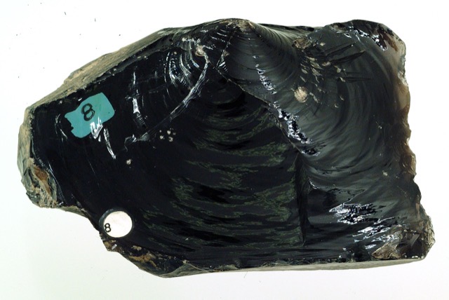
Obsidian is volcanic glass that cools too fast for mineral crystals to form. With no crystal structure to scatter light unpredictably, it reaches a genuinely neutral, near-black colour rather than a very dark shade of some other hue.
In practice: It's a useful comparison point for judging whether a 'black' material actually carries a colour cast — like charcoal's subtle blue undertone — or is close to truly neutral.
Used in room palettes
Charcoal appears in the following curated Interiors room palettes.
Calm neutral bedroom
Restful, understated, easy to live with long-term.
Deliberately low-contrast throughout — the palette's calm comes from restraint, not from a strong focal contrast.
Greige can lean noticeably cooler in a north-facing bedroom — see the north-facing rooms lighting guide before committing to a large wall.
Charcoal and oak home office
Focused, professional, good on video calls.
Single dark accent wall against paler surrounding walls, a common way to use a saturated colour in a small footprint.
Check how the charcoal wall reads on camera under your actual desk lighting, not only in person, if the room doubles as a video-call backdrop.
Black-fixture monochrome bathroom
Contemporary, graphic, confident in a small footprint.
High value contrast between pale walls and black fixtures is the entire point of this scheme.
Matte and gloss black fixtures reflect light very differently from each other — check the specific finish under the bathroom's actual lighting before committing.
Used in outfit palettes
Charcoal appears in the following curated Fashion outfit palettes.
Cool monochrome office
Sharp, professional, unfussy.
Cool greys can look flat under fluorescent office lighting specifically — worth checking the combination under your actual workplace lighting.
Pairings
Subtle, bold, analogous, complementary and neutral options — established design convention, not a guarantee of visual success in every context.
Complementary
Opposite hues (180° apart) for maximum hue contrast.
Analogous
Neighbouring hues on the colour wheel for a low-contrast, harmonious feel.
Analogous
Neighbouring hues on the colour wheel for a low-contrast, harmonious feel.
No curated profile yet
Triadic
Three hues evenly spaced around the colour wheel for balanced contrast.
Triadic
Three hues evenly spaced around the colour wheel for balanced contrast.
No curated profile yet
Split-complementary
The two hues bracketing the complement, for contrast with less tension.
Split-complementary
The two hues bracketing the complement, for contrast with less tension.
No curated profile yet
Tetradic
Four hues at 90° steps around the colour wheel for a rich, varied palette.
Tetradic
Four hues at 90° steps around the colour wheel for a rich, varied palette.
Tetradic
Four hues at 90° steps around the colour wheel for a rich, varied palette.
Monochromatic
Same hue at different lightness levels, for a cohesive tonal palette.
Monochromatic
Same hue at different lightness levels, for a cohesive tonal palette.
Monochromatic
Same hue at different lightness levels, for a cohesive tonal palette.
Monochromatic
Same hue at different lightness levels, for a cohesive tonal palette.
For an accessible, low-contrast-risk pairing, monochromatic (same-hue) combinations are usually the safest starting point — see the harmonies above.
Uses & contexts
Often confused with
Using this colour in a real room
What colour should I paint my front door?Front door colour ideasWhat colour front door works with red brick?Front door colours for red-brick housesWhat colour rug should I choose for my flooring?Rug colour ideasWhat colour should I choose for a feature wall?Feature wall colour ideasShould I paint the walls, ceiling and woodwork the same colour?When colour drenching worksWhat colour should I paint the woodwork?How to coordinate walls and woodwork
Using charcoal in a real space
Worked out from this colour’s own measurements — its lightness, saturation and undertone — rather than written for it. That is why the guidance differs from one colour to the next even when the two look similar.
What role it can play
This is a large-surface colour. At chroma 9 it is restrained enough to cover a lot of ground without tiring, and too quiet to work as an accent.
Walls and large surfaces
strongChroma 9 sits inside the range walls and large surfaces carry without taking over the room. At L*28 it also absorbs a good deal of the light in the room, so plan the lighting alongside it rather than afterwards.
Secondary surfaces
strongChroma 9 sits inside the range secondary surfaces carry without taking over the room.
Furniture
strongChroma 9 sits inside the range furniture carry without taking over the room.
Rugs, curtains and bedding
strongChroma 9 sits inside the range rugs, curtains and bedding carry without taking over the room.
Trim and joinery
strongChroma 9 sits inside the range trim and joinery carry without taking over the room.
Accents and small objects
difficultAt chroma 9 this is too quiet to read as an accent — it will look like something that happened rather than something chosen.
As an accent: high-contrast accent
With almost no chroma, this works as an accent only through lightness. Against a mid-toned room it contrasts by being much lighter or much darker, not by being colourful.
How to distribute colour across a roomHow it behaves under different lightsensitive
- Under warm bulbs
- Warm bulbs emit little short-wavelength energy, so there is less for a blue to reflect. At this low chroma there is nothing in reserve, so expect it to go noticeably grey or muddy after dark.
- Under cool bulbs
- Cool light flatters this — it will hold its identity and may read slightly more saturated than in warm light.
- In daylight
- Deep colours hold their identity in daylight better than pale ones, because there is more of the range left to work in. This will look most like itself in good indirect light.
- In a dim room
- At low light levels the eye's colour discrimination genuinely falls and deep colours converge toward each other. This will read as "dark" rather than as its own colour in a dim room unless it is lit.
- Compared with the sample card
- Already deep, so there is little further to fall — but on a large matte surface it will absorb enough light to look flatter than the sample.
What colour temperature actually means · Why two bulbs at the same rating can differ
With wood
Oak
works wellOpposite in undertone to Oak, and separated enough in hue that the difference reads as deliberate contrast rather than as a clash. The amount of timber matters as much as the tone: one piece is an accent, a floor plus joinery is the room's dominant colour.
Walnut
works wellOpposite in undertone to Walnut, and separated enough in hue that the difference reads as deliberate contrast rather than as a clash. The amount of timber matters as much as the tone: one piece is an accent, a floor plus joinery is the room's dominant colour.
Pine
works wellOpposite in undertone to Pine, and separated enough in hue that the difference reads as deliberate contrast rather than as a clash. The amount of timber matters as much as the tone: one piece is an accent, a floor plus joinery is the room's dominant colour.
Plywood
works wellOpposite in undertone to Plywood, and separated enough in hue that the difference reads as deliberate contrast rather than as a clash. The amount of timber matters as much as the tone: one piece is an accent, a floor plus joinery is the room's dominant colour.
Light wood (ash, birch, beech)
works wellOpposite in undertone to Light wood (ash, birch, beech), and separated enough in hue that the difference reads as deliberate contrast rather than as a clash. The amount of timber matters as much as the tone: one piece is an accent, a floor plus joinery is the room's dominant colour.
Dark wood
works wellOpposite in undertone to Dark wood, and separated enough in hue that the difference reads as deliberate contrast rather than as a clash. The amount of timber matters as much as the tone: one piece is an accent, a floor plus joinery is the room's dominant colour.
Reddish wood (mahogany, cherry, teak)
works wellOpposite in undertone to Reddish wood (mahogany, cherry, teak), and separated enough in hue that the difference reads as deliberate contrast rather than as a clash. The amount of timber matters as much as the tone: one piece is an accent, a floor plus joinery is the room's dominant colour.
With metal fittings
Brass
works wellShares Brass's cool bias, so the two agree about the temperature of the room. There is also 39 points of lightness between them, which keeps the two readable as separate elements. Metal carries more attention than its area suggests, so repetition matters more than the exact finish.
Gold-tone
works wellShares Gold-tone's cool bias, so the two agree about the temperature of the room. There is also 39 points of lightness between them, which keeps the two readable as separate elements. Metal carries more attention than its area suggests, so repetition matters more than the exact finish.
Chrome
works wellShares Chrome's cool bias, so the two agree about the temperature of the room. There is also 52 points of lightness between them, which keeps the two readable as separate elements. Metal carries more attention than its area suggests, so repetition matters more than the exact finish.
Stainless steel
works wellShares Stainless steel's cool bias, so the two agree about the temperature of the room. There is also 48 points of lightness between them, which keeps the two readable as separate elements. Metal carries more attention than its area suggests, so repetition matters more than the exact finish.
Black metal
needs careThis sits close to Black metal without matching it — near enough that the eye reads an attempted match and far enough that it fails. Either move decisively away or repeat the tone exactly.
Copper
works wellShares Copper's cool bias, so the two agree about the temperature of the room. There is also 39 points of lightness between them, which keeps the two readable as separate elements. Metal carries more attention than its area suggests, so repetition matters more than the exact finish.
Where it can go wrong
- May flatten against similar neutrals. With so little chroma the only thing separating this from a neighbouring beige or grey is lightness, so anything within about fifteen points of it will merge.
- May go muddy under weak warm light. A cool colour with little chroma has nothing in reserve when the source is short of short-wavelength energy, which is the single most common complaint about pale cool greys.
Continue exploring
Related questionThe history of blackBlack has meant mourning, formality, rebellion and luxury at different times and in different cultures — its meaning has always depended heavily on context rather than being fixed.Colour familyRelated questionThe history of greyGrey has moved from a largely utilitarian, undyed or industrial colour to a deliberately chosen, sophisticated neutral in modern interiors, fashion and branding.Colour familyRelated questionVolcanicNear-black mineral tones contrast sharply with a hot ember-orange accent, mirroring the dark rock and glowing lava of volcanic landscapes.Nature palette
Meaning & story
Interiors
- Often used for a dramatic, grounding accent wall or joinery colour.
Name origin
- Named for the dark grey-black colour of charred wood charcoal.
Fashion
- Worn as a softer alternative to black in tailoring, particularly for suits and coats, where pure black can look severe under bright light.
Accessibility
- Its blue undertone is subtle and can disappear entirely under warm lighting, so charcoal often looks close to a neutral black-grey indoors even though it reads distinctly cool in daylight.
True of the neutral family generally
Inherited from the neutral hue family, not specifically documented about this exact shade — see methodology.
- Blue is often considered calming and is widely used in corporate branding, particularly in finance and technology, to convey trust and stability.
- Blue, and ultramarine in particular, is traditionally associated with the Virgin Mary in Christian art, historically used for her robes in Renaissance and medieval European painting.
Pigment & family history
Moods
Terminology
Lighter, darker & directional variants
Calculated directional adjustments. Some directions converge on the same result from this starting colour — shown as one merged card with an explanation, not repeated duplicates. Generated shades link to a curated profile only when one is close enough.
Lighter
Lightness increased
Darker
Lightness decreased
Warmer & Greener & Yellower
Hue rotated toward warm (red/orange) From this starting colour, moving warmer and greener and yellower converges on the same calculated result.
Cooler & Bluer & Redder
Hue rotated toward cool (blue) From this starting colour, moving cooler and bluer and redder converges on the same calculated result.
More muted
Saturation softened
More saturated
Saturation increased
Technical details
Technical values
CMYK is an approximate device conversion, not a calibrated print value — see methodology.
Convert this colour to another format →
Common design-industry reference value for the named colour.
Characteristics
- Hue family
- blue
- Undertone
- cool
- Tone depth
- deep
- Pastel
- No
- Earth tone
- No
- Jewel tone
- No
- Vivid
- No
- Greyness
- 68%
- Visual weight
- 57/100
Accessibility
vs. white text
9.90:1 — AAA
vs. black text
2.12:1 — fails
Confidence: medium · Qualification: identity_only, technically_qualified, curated_profile_eligible, search_index_eligible, comparison_eligible, premium_report_eligible
Spotted something wrong? Suggest a correction.