Blush Pink
A soft, muted pink with a warm beige undertone.
At a glance
- Hue family
- red
- Warmth
- neutral
- Tone depth
- pale
- Saturation
- Pastel
Similar to
Quick intelligence summary
- Feels like
- neutral, pale, soft/pastel
- Works well with
- See the pairings section below for calculated harmony options.
- Common uses
- Interiors and fashion — see uses & contexts below.
- Accessibility snapshot
- Pairs better with black text (14.2:1) than white (1.5:1).
- Important cautions
- As a pale, desaturated colour, it needs its contrast checked directly before use as a text background — don't assume a pastel is automatically safe to pair with pale text.
See this colour in the real world
Colours in photographs vary with lighting, material, camera processing and screen calibration — the named colours below are visual approximations, not exact measurements.
.jpg)
This peony cultivar ('Roselette') is described by its grower as blush pink — petals often shift paler toward the edges and deeper pink toward the centre, as seen here.
This photo was hand-cropped to the flower itself before colour clustering; the wider frame's green garden foliage would otherwise dominate an automated whole-frame scan."Paeonia 'Roselette'" by F. D. Richards, CC BY-SA 2.0, via Wikimedia CommonsLicence details
- Source:
- Wikimedia Commons
- Creator:
- F. D. Richards
- Licence:
- CC BY-SA 2.0 — free to share and adapt commercially, provided the work is attributed and any adaptation is shared under the same licence. Reviewed and confirmed by the Commons FlickreviewR 2 bot from the original Flickr upload.
- Reviewed:
- 2026-07-24
.jpg)
Rose quartz's soft pink comes from trace titanium, manganese or microscopic mineral fibres in the quartz — scientists are still not entirely certain which.
Photographed against a black backdrop specifically to document the specimen; that backdrop was excluded when choosing this palette so it reflects the mineral itself, not the background."Rose quartz" by Darla Sondrol, Geoscience Digital Image Library (GeoDIL), CC0Licence details
- Source:
- Wikimedia Commons
- Creator:
- Darla Sondrol
- Licence:
- CC0 1.0 Universal Public Domain Dedication — the copyright holder has waived all rights; free to use for any purpose, including commercially, without asking permission.
- Reviewed:
- 2026-07-24

Rose gold gets its pink-orange cast from copper alloyed into the gold — more copper produces a stronger pink, which is why 'rose gold' varies noticeably between pieces and manufacturers.
This ring was photographed against a warm-toned surface with brightness close to the metal's own colour, which makes an automated whole-frame scan a poor guide to the ring alone — this palette was reviewed by hand, though the low contrast between ring and background limits how precisely the band's own colour can be isolated from a photo."Rose Gold Diamond Engagement Ring" by Petragems, CC BY-SA 4.0, via Wikimedia CommonsLicence details
- Source:
- Wikimedia Commons
- Creator:
- Petragems
- Licence:
- CC BY-SA 4.0 — free to share and adapt commercially, provided the work is attributed and any adaptation is shared under the same licence.
- Reviewed:
- 2026-07-25
Colour stories
Why rose quartz and amethyst are the same mineral, different colours
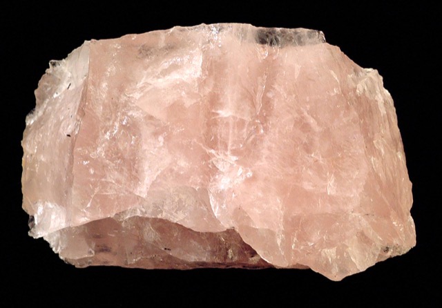
Rose quartz and amethyst are both varieties of quartz — silicon dioxide with the same crystal structure. Trace titanium, manganese or microscopic mineral fibres tint quartz pink; trace iron, altered by natural background radiation over geological time, tints it purple instead.
In practice: Colour in minerals often comes down to which trace element got trapped in the crystal as it grew, not a fundamentally different material — a useful reminder that a name like 'quartz' describes structure, not colour.
Why a peony's petals fade from deep pink to pale blush
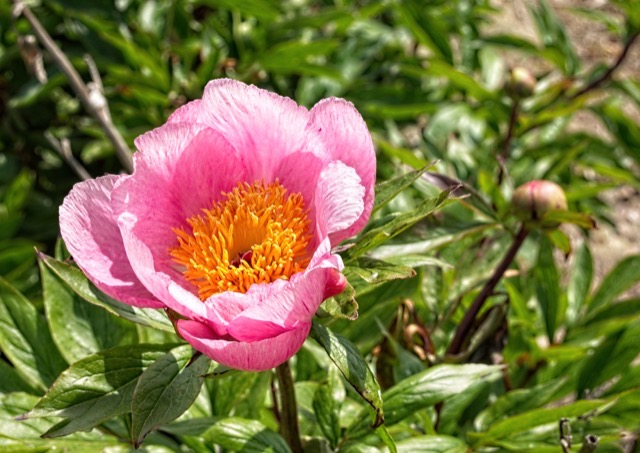
Many peony cultivars show a genuine colour gradient across a single bloom, with pigment concentration highest near the base of each petal and fading toward the edge. Growers often describe the same cultivar with several names — blush pink, rose pink, clear pink — because the colour realistically isn't uniform across the flower.
In practice: When matching a 'blush pink' flower to a swatch, the named colour is necessarily an average of a real gradient, not one measured point on the petal.
Used in room palettes
Blush Pink appears in the following curated Interiors room palettes.
Concrete and blush modern living room
Contemporary, soft-meets-industrial.
Warm wall against cool floor and hardware — a deliberate temperature contrast rather than a value contrast.
Polished concrete is highly reflective — expect real glare and colour-bounce effects a flat swatch can't show; view a sample under the room's actual lighting.
Concrete's real colour varies considerably by mix, sealant and polish level — treat grey here as a general direction, not a specific concrete's exact tone.
Used in outfit palettes
Blush Pink appears in the following curated Fashion outfit palettes.
Soft blush and grey
Gentle, understated, easy to wear.
Pale, muted colours like these are especially sensitive to bulb colour temperature — check the pairing under both daylight and your usual indoor lighting.
Pairings
Subtle, bold, analogous, complementary and neutral options — established design convention, not a guarantee of visual success in every context.
Complementary
Opposite hues (180° apart) for maximum hue contrast.
Analogous
Neighbouring hues on the colour wheel for a low-contrast, harmonious feel.
Analogous
Neighbouring hues on the colour wheel for a low-contrast, harmonious feel.
Triadic
Three hues evenly spaced around the colour wheel for balanced contrast.
Triadic
Three hues evenly spaced around the colour wheel for balanced contrast.
Split-complementary
The two hues bracketing the complement, for contrast with less tension.
Split-complementary
The two hues bracketing the complement, for contrast with less tension.
No curated profile yet
Tetradic
Four hues at 90° steps around the colour wheel for a rich, varied palette.
Tetradic
Four hues at 90° steps around the colour wheel for a rich, varied palette.
Tetradic
Four hues at 90° steps around the colour wheel for a rich, varied palette.
Monochromatic
Same hue at different lightness levels, for a cohesive tonal palette.
Monochromatic
Same hue at different lightness levels, for a cohesive tonal palette.
Monochromatic
Same hue at different lightness levels, for a cohesive tonal palette.
Monochromatic
Same hue at different lightness levels, for a cohesive tonal palette.
For an accessible, low-contrast-risk pairing, monochromatic (same-hue) combinations are usually the safest starting point — see the harmonies above.
Uses & contexts
Often confused with
Using blush pink in a real space
Worked out from this colour’s own measurements — its lightness, saturation and undertone — rather than written for it. That is why the guidance differs from one colour to the next even when the two look similar.
What role it can play
This is a large-surface colour. At chroma 17 it is restrained enough to cover a lot of ground without tiring, and too quiet to work as an accent.
Walls and large surfaces
strongChroma 17 sits inside the range walls and large surfaces carry without taking over the room.
Secondary surfaces
strongChroma 17 sits inside the range secondary surfaces carry without taking over the room.
Furniture
strongChroma 17 sits inside the range furniture carry without taking over the room.
Rugs, curtains and bedding
strongChroma 17 sits inside the range rugs, curtains and bedding carry without taking over the room.
Trim and joinery
strongChroma 17 sits inside the range trim and joinery carry without taking over the room. Its lightness makes it a conventional trim choice, which is a strength when the walls should be the subject.
Accents and small objects
difficultAt chroma 17 this is too quiet to read as an accent — it will look like something that happened rather than something chosen.
As an accent: tonal anchor
Too quiet to be an accent but definite enough to build a tonal scheme around — several depths of this hue will read as considered rather than as timid.
How to distribute colour across a roomHow it behaves under different lightmoderate
- Under warm bulbs
- With almost no hue of its own, this mostly reports the colour of the light. Under warm bulbs it will read warm — which is not the colour changing but the colour being honest.
- Under cool bulbs
- Near-neutral under any source, so a cool bulb will simply make it read cool.
- In daylight
- In strong daylight a colour this light approaches the top of its range, and differences between it and other pale colours compress. It can look washed out at midday in a south-facing room and return in the evening.
- In a dim room
- Enough lightness and chroma to stay recognisable in a dim room, though it will lose some saturation.
- Compared with the sample card
- Pale colours almost always read darker in place than on a card, because a card is seen against white and a wall is seen against itself. Expect a step down.
What colour temperature actually means · Why two bulbs at the same rating can differ
With wood
Oak
works wellShares Oak's neutral bias, so the two agree about the temperature of the room. They sit close in depth, so expect a quiet, tonal relationship rather than a contrast. The amount of timber matters as much as the tone: one piece is an accent, a floor plus joinery is the room's dominant colour.
Walnut
works wellShares Walnut's neutral bias, so the two agree about the temperature of the room. There is also 57 points of lightness between them, which keeps the two readable as separate elements. The amount of timber matters as much as the tone: one piece is an accent, a floor plus joinery is the room's dominant colour.
Pine
works wellShares Pine's neutral bias, so the two agree about the temperature of the room. They sit close in depth, so expect a quiet, tonal relationship rather than a contrast. The amount of timber matters as much as the tone: one piece is an accent, a floor plus joinery is the room's dominant colour.
Plywood
works wellShares Plywood's neutral bias, so the two agree about the temperature of the room. They sit close in depth, so expect a quiet, tonal relationship rather than a contrast. The amount of timber matters as much as the tone: one piece is an accent, a floor plus joinery is the room's dominant colour.
Light wood (ash, birch, beech)
works wellShares Light wood (ash, birch, beech)'s neutral bias, so the two agree about the temperature of the room. They sit close in depth, so expect a quiet, tonal relationship rather than a contrast. The amount of timber matters as much as the tone: one piece is an accent, a floor plus joinery is the room's dominant colour.
Dark wood
works wellShares Dark wood's neutral bias, so the two agree about the temperature of the room. There is also 63 points of lightness between them, which keeps the two readable as separate elements. The amount of timber matters as much as the tone: one piece is an accent, a floor plus joinery is the room's dominant colour.
Reddish wood (mahogany, cherry, teak)
works wellShares Reddish wood (mahogany, cherry, teak)'s neutral bias, so the two agree about the temperature of the room. There is also 57 points of lightness between them, which keeps the two readable as separate elements. The amount of timber matters as much as the tone: one piece is an accent, a floor plus joinery is the room's dominant colour.
With metal fittings
Brass
works wellShares Brass's neutral bias, so the two agree about the temperature of the room. They sit close in depth, so expect a quiet, tonal relationship rather than a contrast. Metal carries more attention than its area suggests, so repetition matters more than the exact finish.
Gold-tone
works wellShares Gold-tone's neutral bias, so the two agree about the temperature of the room. They sit close in depth, so expect a quiet, tonal relationship rather than a contrast. Metal carries more attention than its area suggests, so repetition matters more than the exact finish.
Chrome
needs careThis sits close to Chrome without matching it — near enough that the eye reads an attempted match and far enough that it fails. Either move decisively away or repeat the tone exactly.
Stainless steel
works wellShares Stainless steel's neutral bias, so the two agree about the temperature of the room. They sit close in depth, so expect a quiet, tonal relationship rather than a contrast. Metal carries more attention than its area suggests, so repetition matters more than the exact finish.
Black metal
works wellShares Black metal's neutral bias, so the two agree about the temperature of the room. There is also 78 points of lightness between them, which keeps the two readable as separate elements. Metal carries more attention than its area suggests, so repetition matters more than the exact finish.
Copper
works wellShares Copper's neutral bias, so the two agree about the temperature of the room. They sit close in depth, so expect a quiet, tonal relationship rather than a contrast. Metal carries more attention than its area suggests, so repetition matters more than the exact finish.
Where it can go wrong
- No characteristic failure mode stands out from this colour's measurements — it sits in a comfortable range for lightness and chroma alike. The usual caution still applies: judge it from a large sample, in place, in the light the room actually gets.
Meaning & story
Interiors
- A popular soft accent in bedrooms and nurseries.
Name origin
- A descriptive name rather than one drawn from a specific plant or material — 'blush' evokes a soft, warm flush of colour rather than one fixed reference point.
Fashion
- Popular in both everyday clothing and bridal wear as a softer alternative to true pink or ivory.
Accessibility
- As a pale, desaturated colour, it needs its contrast checked directly before use as a text background — don't assume a pastel is automatically safe to pair with pale text.
True of the pink family generally
Inherited from the pink hue family, not specifically documented about this exact shade — see methodology.
- Red is traditionally associated with luck, prosperity and celebration in Chinese culture, and is prominently used at weddings and during Lunar New Year.
- Red is widely associated with love, passion and romance in many Western contexts.
- Red-green colour pairings can be difficult to distinguish for people with the most common forms of colour vision deficiency (protanopia and deuteranopia) — avoid relying on red vs. green alone to convey status or meaning.
- Red is commonly used as a warning or stop signal in traffic-control and safety systems in many countries.
Pigment & family history
Moods
Lighter, darker & directional variants
Calculated directional adjustments. Some directions converge on the same result from this starting colour — shown as one merged card with an explanation, not repeated duplicates. Generated shades link to a curated profile only when one is close enough.
Lighter
Lightness increased
Darker
Lightness decreased
Warmer & Greener & Yellower
Hue rotated toward warm (red/orange) From this starting colour, moving warmer and greener and yellower converges on the same calculated result.
Cooler & Bluer
Hue rotated toward cool (blue) From this starting colour, moving cooler and bluer converges on the same calculated result.
Redder
Hue rotated toward red This is close to the source colour itself — there is limited room left to move redder from here.
More muted
Saturation softened
More saturated
Saturation increased
Technical details
Technical values
CMYK is an approximate device conversion, not a calibrated print value — see methodology.
Convert this colour to another format →
Common design-industry reference value for the named colour.
Characteristics
- Hue family
- red
- Undertone
- neutral
- Tone depth
- pale
- Pastel
- Yes
- Earth tone
- No
- Jewel tone
- No
- Vivid
- No
- Greyness
- 81%
- Visual weight
- 15/100
Accessibility
vs. white text
1.47:1 — fails
vs. black text
14.25:1 — AAA
Confidence: medium · Qualification: identity_only, technically_qualified, curated_profile_eligible, search_index_eligible, comparison_eligible, premium_report_eligible
Spotted something wrong? Suggest a correction.