Lime Green
A bright, yellow-leaning green.
At a glance
- Hue family
- green
- Warmth
- cool
- Tone depth
- medium
- Saturation
- Vivid
Similar to
Quick intelligence summary
- Feels like
- cool, medium, vivid
- Works well with
- See the pairings section below for calculated harmony options.
- Common uses
- See uses & contexts below for interiors, fashion and practical guidance.
- Accessibility snapshot
- Pairs better with black text (9.9:1) than white (2.1:1).
- Important cautions
- Its high brightness gives strong contrast against dark backgrounds, but pairing it with white or pale yellow text usually fails WCAG contrast requirements.
See this colour in the real world
Colours in photographs vary with lighting, material, camera processing and screen calibration — the named colours below are visual approximations, not exact measurements.

A saturated frame colour like this sits directly beside the eyes, so it becomes one of the strongest colours on the whole face — worth choosing deliberately rather than as an afterthought.
The black studio background dominates a raw automated scan of this photo — this palette was reviewed to represent the frame's actual bright green colour, which occupies a small part of the frame."Sonnenbrille gruen" by Tetzemann, CC0, via Wikimedia CommonsLicence details
- Source:
- Wikimedia Commons
- Creator:
- Tetzemann
- Licence:
- CC0 1.0 Universal Public Domain Dedication — free for any use including commercial, without attribution required.
- Reviewed:
- 2026-07-25
Colour stories
Why eyewear can become the strongest colour near the face
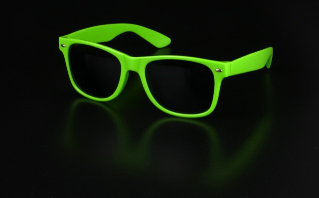
Eyewear frames a small, high-attention area directly around the eyes — one of the first places the eye is drawn on another person's face — so even a modestly saturated frame colour can end up reading as the single most prominent colour choice in an entire outfit.
In practice: Choose a bold frame colour deliberately rather than as an afterthought, since it will likely carry more visual weight than its physical size suggests.
Pairings
Subtle, bold, analogous, complementary and neutral options — established design convention, not a guarantee of visual success in every context.
Complementary
Opposite hues (180° apart) for maximum hue contrast.
Analogous
Neighbouring hues on the colour wheel for a low-contrast, harmonious feel.
Analogous
Neighbouring hues on the colour wheel for a low-contrast, harmonious feel.
Triadic
Three hues evenly spaced around the colour wheel for balanced contrast.
Triadic
Three hues evenly spaced around the colour wheel for balanced contrast.
Split-complementary
The two hues bracketing the complement, for contrast with less tension.
Split-complementary
The two hues bracketing the complement, for contrast with less tension.
Tetradic
Four hues at 90° steps around the colour wheel for a rich, varied palette.
Tetradic
Four hues at 90° steps around the colour wheel for a rich, varied palette.
Tetradic
Four hues at 90° steps around the colour wheel for a rich, varied palette.
Monochromatic
Same hue at different lightness levels, for a cohesive tonal palette.
Monochromatic
Same hue at different lightness levels, for a cohesive tonal palette.
Monochromatic
Same hue at different lightness levels, for a cohesive tonal palette.
Monochromatic
Same hue at different lightness levels, for a cohesive tonal palette.
For an accessible, low-contrast-risk pairing, monochromatic (same-hue) combinations are usually the safest starting point — see the harmonies above.
Uses & contexts
Using lime green in a real space
Worked out from this colour’s own measurements — its lightness, saturation and undertone — rather than written for it. That is why the guidance differs from one colour to the next even when the two look similar.
What role it can play
This is a small-scale colour. At chroma 91 it holds attention easily, which is a strength on a cushion or a door and a liability across four walls.
Walls and large surfaces
difficultAt chroma 91 this is far above the level walls and large surfaces usually carry comfortably. It can be done deliberately, but it will be the room rather than part of it.
Secondary surfaces
difficultAt chroma 91 this is far above the level secondary surfaces usually carry comfortably. It can be done deliberately, but it will be the room rather than part of it.
Furniture
difficultAt chroma 91 this is far above the level furniture usually carry comfortably. It can be done deliberately, but it will be the room rather than part of it.
Rugs, curtains and bedding
difficultAt chroma 91 this is far above the level rugs, curtains and bedding usually carry comfortably. It can be done deliberately, but it will be the room rather than part of it.
Trim and joinery
workableChroma 91 is above the usual comfort level for trim and joinery, so expect it to take charge. That is a legitimate choice in a room that wants a subject. Trim is a small area but a long edge, so it reads more than its square metreage suggests.
Accents and small objects
strongChroma 91 is exactly what an accent is for. The saturation that makes this difficult across a wall is the reason it works on a cushion, a door or a single chair.
As an accent: one controlled accent
At chroma 91 this is assertive enough that one appearance is a statement and three is a scheme. Use it once, deliberately, and let the rest of the room stay quiet.
How to distribute colour across a roomHow it behaves under different lightresilient
- Under warm bulbs
- Warm bulbs emit little short-wavelength energy, so there is less for a green to reflect. There is enough chroma here to survive it, though it will read warmer and slightly duller.
- Under cool bulbs
- Cool light flatters this — it will hold its identity and may read slightly more saturated than in warm light.
- In daylight
- A mid-tone reads most consistently across the day, which is why so much upholstery sits in this band.
- In a dim room
- Enough lightness and chroma to stay recognisable in a dim room, though it will lose some saturation.
- Compared with the sample card
- Pale colours almost always read darker in place than on a card, because a card is seen against white and a wall is seen against itself. Expect a step down.
What colour temperature actually means · Why two bulbs at the same rating can differ
With wood
Oak
needs careOpposed in undertone to Oak without much else to explain the difference, which is the combination the eye most often reads as an error. The amount of timber matters as much as the tone: one piece is an accent, a floor plus joinery is the room's dominant colour.
Walnut
works wellOpposite in undertone to Walnut, and separated enough in depth that the difference reads as deliberate contrast rather than as a clash. The amount of timber matters as much as the tone: one piece is an accent, a floor plus joinery is the room's dominant colour.
Pine
needs careOpposed in undertone to Pine without much else to explain the difference, which is the combination the eye most often reads as an error. The amount of timber matters as much as the tone: one piece is an accent, a floor plus joinery is the room's dominant colour.
Plywood
needs careOpposed in undertone to Plywood without much else to explain the difference, which is the combination the eye most often reads as an error. The amount of timber matters as much as the tone: one piece is an accent, a floor plus joinery is the room's dominant colour.
Light wood (ash, birch, beech)
needs careOpposed in undertone to Light wood (ash, birch, beech) without much else to explain the difference, which is the combination the eye most often reads as an error. The amount of timber matters as much as the tone: one piece is an accent, a floor plus joinery is the room's dominant colour.
Dark wood
works wellOpposite in undertone to Dark wood, and separated enough in depth that the difference reads as deliberate contrast rather than as a clash. The amount of timber matters as much as the tone: one piece is an accent, a floor plus joinery is the room's dominant colour.
Reddish wood (mahogany, cherry, teak)
works wellOpposite in undertone to Reddish wood (mahogany, cherry, teak), and separated enough in depth that the difference reads as deliberate contrast rather than as a clash. The amount of timber matters as much as the tone: one piece is an accent, a floor plus joinery is the room's dominant colour.
With metal fittings
Brass
needs careShares Brass's cool bias, but at chroma 91 against a material that already carries colour of its own, the two compete rather than combine. It works when this colour is confined to a small area and fails when both are large. Metal carries more attention than its area suggests, so repetition matters more than the exact finish.
Gold-tone
needs careShares Gold-tone's cool bias, but at chroma 91 against a material that already carries colour of its own, the two compete rather than combine. It works when this colour is confined to a small area and fails when both are large. Metal carries more attention than its area suggests, so repetition matters more than the exact finish.
Chrome
works wellShares Chrome's cool bias, so the two agree about the temperature of the room. They sit close in depth, so expect a quiet, tonal relationship rather than a contrast. Metal carries more attention than its area suggests, so repetition matters more than the exact finish.
Stainless steel
works wellShares Stainless steel's cool bias, so the two agree about the temperature of the room. They sit close in depth, so expect a quiet, tonal relationship rather than a contrast. Metal carries more attention than its area suggests, so repetition matters more than the exact finish.
Black metal
works wellShares Black metal's cool bias, so the two agree about the temperature of the room. There is also 65 points of lightness between them, which keeps the two readable as separate elements. Metal carries more attention than its area suggests, so repetition matters more than the exact finish.
Copper
needs careShares Copper's cool bias, but at chroma 91 against a material that already carries colour of its own, the two compete rather than combine. It works when this colour is confined to a small area and fails when both are large. Metal carries more attention than its area suggests, so repetition matters more than the exact finish.
Where it can go wrong
- May overwhelm at any size above an accent. At chroma 91 this holds attention involuntarily, so a room containing much of it will be about this colour whether or not that was intended. It also makes every other colour in the room look more muted by comparison.
Continue exploring
Meaning & story
Mood
- A high-energy, highly saturated green often used for sportswear and high-visibility safety clothing.
Accessibility
- Its high brightness gives strong contrast against dark backgrounds, but pairing it with white or pale yellow text usually fails WCAG contrast requirements.
True of the green family generally
Inherited from the green hue family, not specifically documented about this exact shade — see methodology.
- Green is often associated with nature, growth and renewal.
- Green holds particular religious and cultural significance in Islamic tradition, historically associated with paradise, and appears widely in the flags and symbols of many Muslim-majority countries.
- Green is strongly associated with Ireland and Irish national identity, notably around Saint Patrick's Day.
- Green is widely used internationally to symbolise environmentalism and ecological causes.
Moods
Terminology
Lighter, darker & directional variants
Calculated directional adjustments. Some directions converge on the same result from this starting colour — shown as one merged card with an explanation, not repeated duplicates. Generated shades link to a curated profile only when one is close enough.
Lighter
Lightness increased
Darker
Lightness decreased
Warmer & Redder & Yellower
Hue rotated toward warm (red/orange) From this starting colour, moving warmer and redder and yellower converges on the same calculated result.
Cooler & Bluer
Hue rotated toward cool (blue) From this starting colour, moving cooler and bluer converges on the same calculated result.
Greener
Hue rotated toward green This is close to the source colour itself — there is limited room left to move greener from here.
More muted
Saturation softened
More saturated
Saturation increased
In nature
Technical details
Technical values
CMYK is an approximate device conversion, not a calibrated print value — see methodology.
Convert this colour to another format →
CSS/web-standard named colour value.
Characteristics
- Hue family
- green
- Undertone
- cool
- Tone depth
- medium
- Pastel
- No
- Earth tone
- No
- Jewel tone
- Yes
- Vivid
- Yes
- Greyness
- 24%
- Visual weight
- 60/100
Accessibility
vs. white text
2.12:1 — fails
vs. black text
9.91:1 — AAA
Confidence: medium · Qualification: identity_only, technically_qualified, curated_profile_eligible, search_index_eligible, comparison_eligible
Spotted something wrong? Suggest a correction.